@Mirpono
Very nice. The style reminds me of the classic adventure game "Another World/Out of This World"
Game & Map Screenshots 10
● ARCHIVED · READ-ONLY
-
-
@Neka Music Circular and square walls aren't a problem, I think. But what I find weird is those cliff tiles at the middle of the map. Having the cliffs be only one tile high make them look incredibly strange. They look more like... cardboard pieces being cut apart and placed on the ground. They don't feel like cliffs at all. :eek:
Trying to spend more time working on my game. Which of these do you guys think looks better?
Spoiler

Should I just ditch the tint? :rolleyes: -

This was a small test project for VxAce (My main project is using MV). I'll be releasing this as a download sometime in the next week. -
@Mr. Detective I much prefer the one with the tint. The one without the tint looks far too bright and cheerful for a rainy night (I assume night because the lamp post is lit). On a different aspect - I would move those lamp posts up half a tile because at the moment they are resting on the kerb edging. Nope, wouldn't happen. Far too unstable. They need to be behind those kerb stones.
-
Just a little more work...
Prepare to Fire -
@JPaulC I LOVE your ISO :)
-
Got a new ship map, but please look at the water splash, I can't find a fitting splash for the curve.
Ship
In-Game -
@Neka Music I think what you would have to do is use one of the animations for either the bottom or the top of a waterfall, edit it to 45 degree angle. If you want help with that, Resource Support would be the place to ask.
-
@Kes good and simple idea, I wouldn't had thought of it and thought a rather lengthy spriting work that I wanted to describe in lenght. LOL @Neka Music Yeah just what @Kes typed down for you! XD
-
Bit of an update:
This is actually two maps, but I photoshopped them together and worked to make them consistent with each other.
I like the effect, so I'll probably do this with most of my maps, although some are broken up by caves/tunnels/mountains/etc...
The labels are mostly there for my own reference as I continue to build upon these areas - but they should also serve to show what I plan on doing with the areas a bit. The next area to the east is a mountain, followed by a tunnel/cave dungeon, which leads to another, larger continent.
-
I love when folks make a map that helps players understand where they are and go; If a character knows his location... doesn't mean the player do. ;)
-
My mapping endeavors continue, this time with my as-of-unnamed "hub" town (it's the only town in my game; the player comes back here whenever they want to upgrade their equipment, buy more items, etc.).
Town WIP
I'm aiming for something small-ish, but reasonably well off and developed by medieval fantasy standards. I'm mostly looking at the sample "Normal Town" map, FFI's Cornelia, and the hub towns from the Strangers of the Power games for inspiration. Especially Cornelia, as like that town this is also a castle town (the actual castle is where the north exit leads and hasn't been mapped yet).
I'm not done decorating yet, and I'm also waffling over throwing an additional building in there, though I'm not sure what it'd be. I'd figured I'd just post this and see if I'm at least on the right track. I'm mostly concerned about the church and to a lesser extent the blacksmith's shop.
I've also been tempted to switch over to FSM tilesets; while I was aiming for a mostly RTP game, Town of Beginnings has a lot of things the RTP Outside tileset's lacking. -
@D.L. Yomegami That map does not say 'town' to me. It is too empty, lots of wasted space and, as far as I can see, no ordinary houses where people can live. You only have 'functional' buildings.
Even though there is so much unused space, you have the armoury so crammed up against the wall that it would, in fact, be impossible to access any of those crates except the front one. You also need to edit your tile sheet layout to move the crates down a half tile if you want to put them up against a wall and have them look natural. At the moment your back crate looks like it's actually stuck on the wall.
If the north exit is going up towards the castle, one must assume that people will enter from the south and go up to it. However, with those vertical flower beds blocking most of the road, that would be extremely difficult. Why reduce the width of the road up to the castle (which we must assume is an important place) and leave the roads to the shops full width?
You have enough lamp posts to light up the runway at an international airport. I get the feeling that you have put in so many simply as a way of trying to fill all that empty space. Where the roads lead to front doors, you need to do some click-shift mapping to remove the kerb stone, otherwise people will be tripping over it to get into the door. -
@AsuranFish That looks really impressive! Just curious, what tileset are you using?
-
@AsuranFish That looks really impressive! Just curious, what tileset are you using?
Thanks! I'm using FSM tilesets - but I had to mix-match them to get the effects I wanted (basically I put some ToB tiles into the WaC tilesets and made new files). -
@D.L. Yomegami I'd say that those are all terrible examples to use for mapping unless you are specifically going for the "retro" feel of the old school maps. I'd say look at FF3/6 maps if you are still trying to go for retro but want a better mapping style.
And now for my screenshot... Assault the Bridge at the battle of Seimu!
Spoiler -
I really love the pixel style in your screenshot. I'm a sucker for graphics like that.@D.L. Yomegami I'd say that those are all terrible examples to use for mapping unless you are specifically going for the "retro" feel of the old school maps. I'd say look at FF3/6 maps if you are still trying to go for retro but want a better mapping style.
And now for my screenshot... Assault the Bridge at the battle of Seimu!
Spoiler
What kind of game is this? Like what do you do in it? It looks interesting and I love ISO stuff.
This was a small test project for VxAce (My main project is using MV). I'll be releasing this as a download sometime in the next week.
Here's a project I've been working on:
Spoiler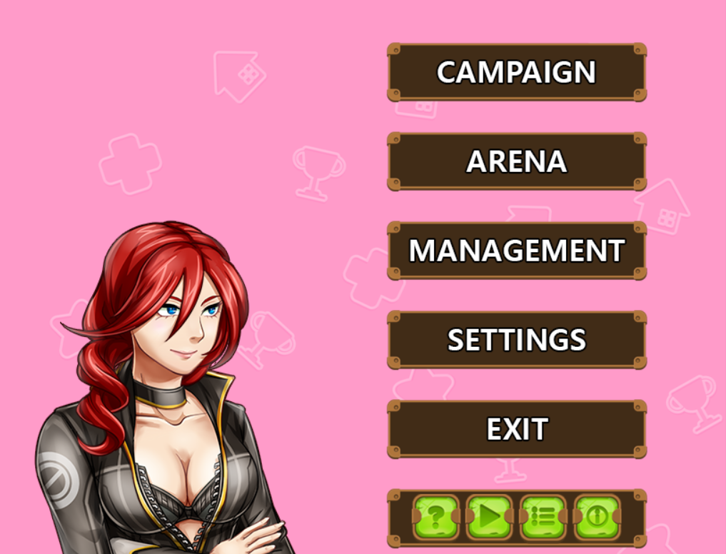
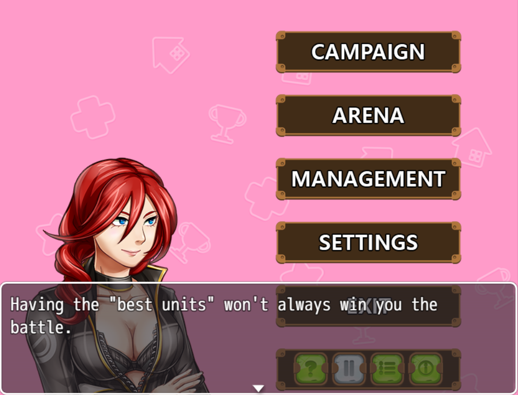
You can click on everything in the project. No movement keys are used in this project. Here is the main menu. This is not the actor menu. I disabled access to that menu, but you can only access that menu via the "management" tab, to which that menu only grants you access to character information, equipment and party management/warehousing.
The green tabs below are as followed:
? = Tutorial window opens up, explaining the game mechanics to you and how to play.
>/II = Auto button. Puts your characters on "auto battle". If you tap on the button again it removes "auto battle" from your characters. "II" means "auto battle" is enabled. ">" means "auto battle" is disabled.Bulletin = Your tasks (quest system)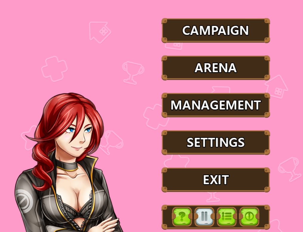
i = Information about the game. This opens up a web page that displays all of the plugins used and credits all of the the authors and used resources.
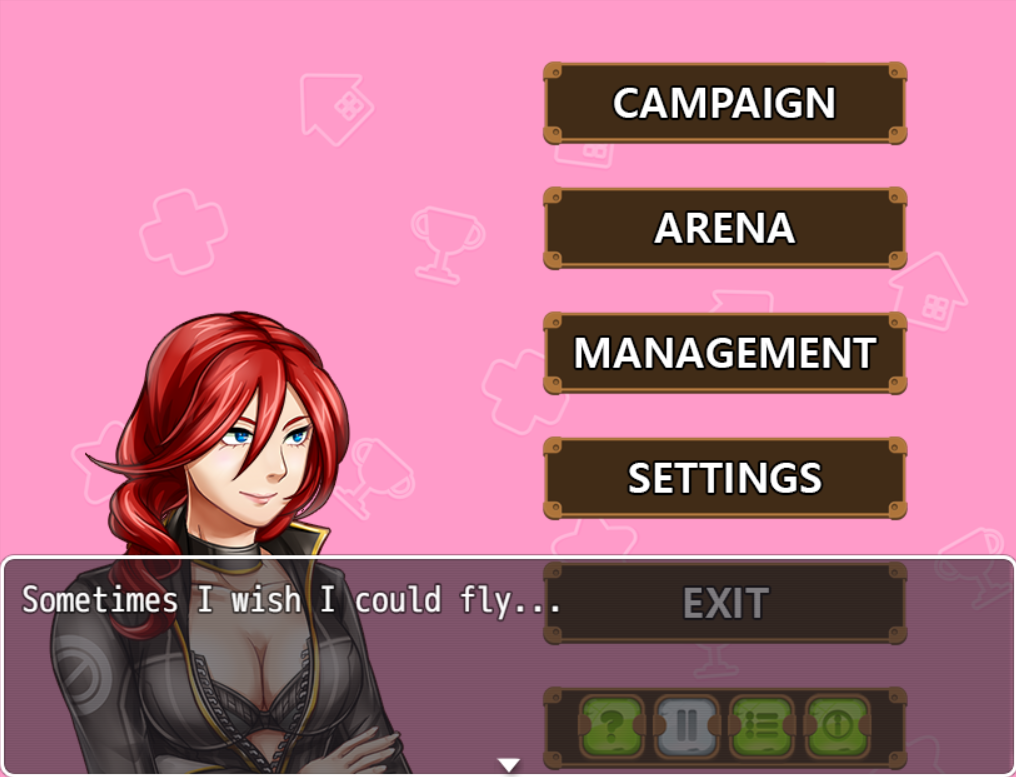
Miss Missy there likes to talk to you. Click on her with your mouse or touch pad and she will say random things to you. Here are some examples: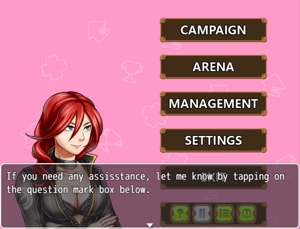
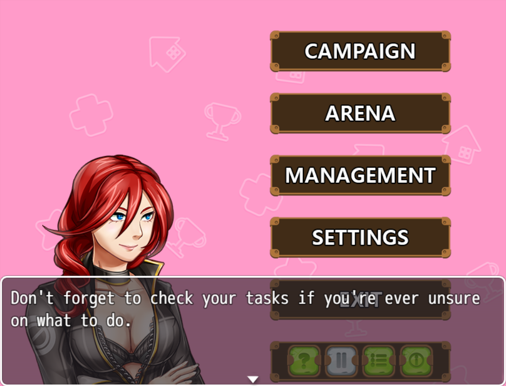
I'm still working on the battle system, but I'll explain that in a later post sometime during this month. -
@D.L. Yomegami I also want to point out that you have what appears to be a swarm at the lower right corner. For a town, especially one near a castle, it really doesn't belong there. Add more houses to your map and make it livelier. Perhaps separate residence area and shopping district into two sides, so it would seem somewhat more realistic.
Spoiler

This is the exterior of a supposedly vacation house. Well, sorta. I tried to make it seem somewhat isolated, but still in good condition. Not sure if the smaller trees contrasts with the bigger ones.
Should I add or remove anything? :p The player can walk on the grass area, too, but there is not much for them to do. -
Been experimenting on making over world sprites. Was thinking of making a smaller game for the one map challenge since I've been in a rut with dog game's plot - so I wanted to try something a bit simpler. I'm not sure how good it is, but I've gotten a few laughs from doing this. Which is a nice change from the frustration I've been having with development lately.
Movement
RollingSpoiler

Spoiler
-
@Mr. Detective Either you care about sizes and proportions (and in this case it's a mess. The trees, door, character sprite, etc. are all over the place) or you don't and keep going.
Some people don't mind it, especially if the rest of the game is good.