Doors that wouldn't even suit hobbits
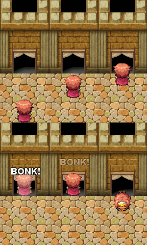
To be honest: they look so bad, I can't understand how some can stick to them. It's not only the size compared to the characters, but also to the walls themself! I mean, in which world is a Wall two times higher than the door?
Alternatives:
Maru's large doors #2
Avery's all directional large doors
Indrah's large doors
Crazy_Leen's large doors
Horses that can't even carry a rider

Well, if you look at the gif you know what I mean ;D
Alternatives:
Maru's large horses
Avery's large horses
Use a recolored RMXP horse instead (if you own RMXP)
Blocky cave walls
Blocky cliffs are something you can get away with in retro styles with not much details - but the default tiles are too detailed and realistic for that!
There are a lot of alternate walls out there and it just improves the look so much!
Avery's round caves and cliffs #2
Maru's round Ice cave and better cliffs
Celianna's round cliffs
Sturmfels' round cliffs
Small tiles

You can get away with minor size problems, but sometimes the problems are HUGE.
What can you do?
There are many resizes (for example Maru has a helicopter and trees and I have a car, truck and tank), but there are too many things to be listed that could be adjusted.
If you notice something looking off, do a little research and/or make a request, you can most definitly be helped!
Bad tile placement
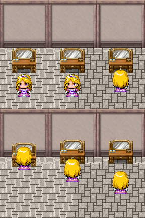
This is something very basic, the tiles are placed in the set to have as many tiles fitting in it as possible - but, who places a shelf 50cm from the wall? (exactly, noone)
What can you do?
Sort the sets a little, throw out the things you never need and adjust the placement. It enhances the look so much with so few skill!
All you need is Gimp and it's grid functions ;3
Here is a tutorial by Indrah that shows some basics:
https://rpgmaker.net/tutorials/696/