The Resource WIP Thread 2
This thread is meant for users who are creating, or editing their own resources, to post their work-in-progress (abbreviated to WIP) and get feedback on their work such as criticism, advice or simple comments.
If you have any game screenshots or maps to show off (including video trailers), please post them in the Game & Map Screenshot Thread.
This is not the thread to look for resources - anything posted in this thread cannot be used!
Previous WIP threads:
The Resource WIP thread 1
Please read and abide by these rules before posting and or commenting:
1. Sprites, portraits, faces, tiles, logos, songs, sound effects - are all allowed as long as it has to do with RPG Maker or Indie Game Maker.
2. When posting your WIP in this thread, please remember that you allow other members to edit that work for criticism.
3. Any work posted in here is not up for grabs and it solemnly belongs to the original creator. Yes, this means you cannot use any resources posted here for yourself, unless it is meant for giving criticism. If the creator eventually posts this in an actual topic in one of the resource forums, then go ahead. Until then, what gets posted here, stays here.
4. When posting a WIP that is not 100% your creation, please note which parts aren't made by you so people can give you more accurate feedback.
5. Please be civil and constructive when handing out criticism. Do not post things such as 'this sucks!' or even 'it's awesome!'. Point out why a work doesn't look so good, and what they can do to improve it. If you want to compliment someone, point out what you think they did well.
6. Please refrain from re-posting your work, unless you've made some edits on it since the last time you posted it. If no one has commented on your work, and it has fallen behind by at least 2 pages, feel free to repost it then.
7. If you have a lot of work to show, please put them behind in spoiler tags! If you want to quote someone's work, I recommend to simply refer to them by name (@Username), or to put the quoted work in spoiler tags. This prevents the thread from cluttering up too much. Preferably, don't quote images at all.
That's it, remember to be civil and give constructive criticism!
The Resource WIP thread 2
● ARCHIVED · READ-ONLY
-
-
Base for a bust set I'm working on. Plan on necroing my gallery after finishing it. Looking for any suggestions or disproportioned features I've overlooked.
Edit: Finished him up. You can download all the bust emotes and such at my gallery: http://forums.rpgmakerweb.com/index.php?/topic/11961-52215-dark-horsemans-art-suppository/

-
XD !!! Ahhh!! First of some DS Style battlers im making!!! Check it out!!!
(Disclaimer: I made the sprite, but i used the DS sprite base from the DS pack. Just fyi....) What'chall think :D ?
EDIT: FACE PALM DX ....I am error.... T_T . Forgot the Tony Stark, red circle thingy on the sprite....but anyway....
EDIT 2: Lol....ok, heres Ro-Borg 1.2....I think i like the original better actually.
-
I updated a sprite. Here it is: View attachment 20902
How did I do?
UPDATE: I edited the sprite as best as I could. Is this fine? -
I appreciate that you're willing to try things that aren't easy and modify the pose as well as the clothing and hair. Nice job! I'm going to be very harsh in my critique, but only because I think it'll help you make it better. Feel free to skip it. You're doing really good on your own, you don't have to follow my advice to make a servicable sprite.
The most significant problem is the shading. It's got some stair stepping and pillow shading and it's causing problems with the readability of the clothing. Think about the shape of the object you're shading and how the light would hit it and where it would be in shadow. Think in volume not lines, you shouldn't be using the lines to judge where the shading should go at all. For example, you've got the arms shaded as if they're completely flat, the only shading is a straight line across the top. There should be some sort of outline on the arms and the shadow cast by the armor should curve to indicate how the arm curves and how it effects the shadow (hint: In this case it means less shadow in the middle, more on the edges). Pretty much all the resources you're going to be using have lighting that comes mostly from the top and slightly to the left, right now your shading on the torso implies that all the light is coming directly from the left and not from above. With the hair it looks like the lighting is coming from directly in front, also not from above. If you get your lighting and shadows consistent the whole thing will be stronger.
It can be helpful to pull out the existing sprites and look closely at how they do things. The RTP uses fairly dark outlines, but they are colored outlines that are affected by the light source. Using that techinique will help the sprites look, especially the scythe.
I hope this is helpful and not depressing. Good luck! -
@Sharm Thanks! I'm not easily depressed, so I'm working on an edit. I'll update it as soon as I finish. (This is my favorite character in the whole game, after all! I need him to look perfect! :p )
-
I believe the hair shading is making the hair look a bit... Puffy. I'm no spriter so I can't offer any in-depth fixes to this. The clothes and such look quite flat compared to the puffy hair... So the shading certainly needs a little more tweaking. It's a decent character, though. I especially like the look of the hands - and the "character design" in general. It just needs some better attention to detail with the shading, mainly.I updated a sprite. Here it is:
 Preview 2.png
How did I do?
UPDATE: I edited the sprite as best as I could. Is this fine?

Practicing drawing rocks for my in-game maps, which are "hand drawn" instead of tiles. This was my best rock out of my practice set. C&C to your heart's content. -
Don't worry. That's deliberate. I MIGHT want to adjust it later. (I know how to do it). He doesn't get haircuts much.I believe the hair shading is making the hair look a bit... Puffy. I'm no spriter so I can't offer any in-depth fixes to this. The clothes and such look quite flat compared to the puffy hair... So the shading certainly needs a little more tweaking. It's a decent character, though. I especially like the look of the hands - and the "character design" in general. It just needs some better attention to detail with the shading, mainly.
Practicing drawing rocks for my in-game maps, which are "hand drawn" instead of tiles. This was my best rock out of my practice set. C&C to your heart's content.
(I have a haircut like that. Very puffy. I'm thinking of getting it trimmed...) -
@Demon God Demigra
The shading on your rock implies that the light is falling from the right. Standard shading in Ace is that light falls from top and slightly left. If you are going to be drawing absolutely everything, then this is not a problem, you simply have to be consistent. If, however, you are going to be mixing this with tiles and/or sprites from elsewhere I think you will have a problem. -
I don't like the XP-Ocean Autotile very much, It just doesn't look very natural in my opinion, so I tried to make an alternate version:
mine:

XP-RTP:

-
I'm drawing everything myself. (Or trying to...)@Demon God Demigra
The shading on your rock implies that the light is falling from the right. Standard shading in Ace is that light falls from top and slightly left. If you are going to be drawing absolutely everything, then this is not a problem, you simply have to be consistent. If, however, you are going to be mixing this with tiles and/or sprites from elsewhere I think you will have a problem. -
@Dark Horseman, wow I don't think I see a thing wrong with him. Great work!
@Deathswallow, the second one follows the DS character sprite much better in the terms of design.
@Avery, I see the difference inbetween the two, yours certainly looks better than the default XP style.
Went ahead and tried to make an animated battler of the rtp skeleton, well at least the iddle. Used some of the battlers I have as a base for height, and used the skeleton ace sprite for color pallet.
I'm a bit unsure of how I did... no I am not good at making gifs. So that's not something I will do.
Right now the cape moves and his eyes glow in and out. Other than that I have yet to decide what else I should animate... any suggestions let me know.

here's the gif:
and ONE pose for the first attack, so no gif:
Thanks! -
@corneredcosmos
quick edit: http://puu.sh/hWv4o/f8795b8af6.png
before animation, your shading needs a little work, if you're going with a pixelated style pixel placement and color matter a lot. skulls don't look good with a hard dark outline like that, break it up. Also, always remember your light source, it was all over the place, if it helps I used to make an overlay layer and take a bright yellow color and mark all the places the light would hit. you can hide the layer and use it as needed so you don't forget. Also the eyes, I'm assuming the idea was for glowy eyes? if so remember the light would be coming from inside the skull so the bottom of the socket would be a brigher light than the top, it would also probably cast a small redish glow to the surrounding areas on the face.... but thats not necessary :D with the cape try to keep the design flowy, i like to take hot pink and and draw things like capes and hair really fast, I feel like i get a more natural look if I don't overthink it. My cape edit was a quick edit, but honestly I'd rework it, do a blowing in the wind effect, it'll show the ripped bottom better. And don't forget that what you're drawing is essentially a 3d object so think about shape and form, on a boot the top of the toe would catch more light than underneat the cuff, etc.
@Avery I like that :) it has a nice flow to it
@ demon god Are you going for a different perspective than the top down? if not, than that is the wrong perspective, it's very flat and you can't see the top of the rock. I like this tutorial: http://www.deviantart.com/art/Scarypet-s-ROCK-ing-tutorial-208101226%C2'> also it looks like you use burn/dodge on that.... please don't it ruins good shading :) hard light and overlay can give you similar effects without being quite as grey if you're unsure on color selection
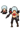
@deathswallow give that poor guy a neck :p and if you're going for pixel art (DS style) then you need to watch color palettes, you have several colors that are almost identical also i'd take of that black outline you added to the head. I know DS style uses a black outline, but I don't believe it does on the hair. I like the pose and the body design, really interesting project :)
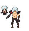
@Darkhorseman I really like him, but since you asked for feedback the only thing I see is that the shadow on his neck has a tiny spot thats not shaded and it seems to me that it should be. Besides that.... maybe you could add some cast shadows from the armor parts? -
Excellent advice thank you Cosmickitty.
I went ahead and used your edit as a new color pallet to practice the shading.
Here's the result with a rough cape flow, still working on it since it is a bit weird:
-
Yeah, I'm pretty noob at making shiny armor or shading it properly. I'll keep that in mind in the future and thank you for the input. I'd have worked on it for this one, but by the time I read your post, I already formatted 16 busts and I'm too lazy to make any changes to them -_-);
-
Thank ya! Im going to be making a ferw different versions of this guy. This is him in a sort of "weakened" pose....he's supposed to appear enfeebled. :D@deathswallow give that poor guy a neck :p and if you're going for pixel art (DS style) then you need to watch color palettes, you have several colors that are almost identical also i'd take of that black outline you added to the head. I know DS style uses a black outline, but I don't believe it does on the hair. I like the pose and the body design, really interesting project :)
Actually about his neck, or lack of one, he's supposed to appear as though he's a little slumped over, hence no neck...because his head and hair are obstructing it. I'll work on the black outline of the hair though. -
After more than six years without touching any traditional visual art anymore, I think I have to reawaken those passion once again.
So at beginning, I have to learn on digital art like a child who enter the elementary school because I never touch this area before.
Just using mouse on photoshop, without any layer (because I don't know how to use layer correctly), I draw this character below. I just realize that using a mouse is quite painful.
Spoiler
-
What is burn/dodge? I used standard brush in Paint Tool SAI. Sorry my shading isn't very good. Haha@ demon god Are you going for a different perspective than the top down? if not, than that is the wrong perspective, it's very flat and you can't see the top of the rock. I like this tutorial: also it looks like you use burn/dodge on that.... please don't it ruins good shading :) hard light and overlay can give you similar effects without being quite as grey if you're unsure on color selection
-
I am Brazilian and I am new in the community so I apologize if you are posting in the wrong place .With that of the fodástico Jared Leto as the new Joker ( the best villain of all time. I was quite inspired,and I finished that char here:
 What did you think ?
I apologize for possible errors English.

-
I can't say much about your Joker character, because I can't do characters to save my life... I think that you need to work on the clothes a bit... color wise.


