Game & Map Screenshots 11

● ARCHIVED · READ-ONLY
Started by Celianna 2067 posts Page 82 of 104 View original ↗
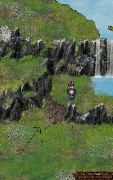
  1. Speaking of differences of level without stairs, i tried to simulate a slope but I'm not sure it would work.

    What do you think?

    Sans titre-2.png
  2. Cathy said:
    @Milennin I'm quite new to rpgm but as a gamer I'd say that the shadow under the trees hurt the eyes, it's really black, maybe gray or some transparency could help.

    Maybe you could add a difference of level in some places so it would be less flat.
    Lol, it's the default RM2K3 tree. But yeah, making it more transparent is a quick fix. Not going to add in too many heights, since the next area will be a lot more focused on that instead. But still changed some parts that you highlighted.
    Untitled-1.png

    Cathy said:
    Speaking of differences of level without stairs, i tried to simulate a slope but I'm not sure it would work.

    What do you think?
    I think if the player is forced to go a route like that, it shouldn't be hard to figure out they can use that slope to go down.
  3. @Milennin It's looks better on my opinion. If you want to soften the shadows I can do it quite fast with photoshop if you give me the template.
  4. Cathy said:
    @Milennin It's looks better on my opinion. If you want to soften the shadows I can do it quite fast with photoshop if you give me the template.
    Thanks for the offer, but I got Photoshop myself. I did soften them by 33%, not sure if that was enough. I never really thought the shadows were that bad, lol.
  5. @Ninjakillzu The new version is a big improvement.

    @Mike-Turtle I don't have time to really look at the maps and comment on them, though first impressions were positive. I will try and come back and have a proper look tomorrow. You asked for other feedback, so here is something that struck me forcefully.

    I hope that the little glowing orb above the heads of some sprites is really, really necessary, because I found it irritating after a while. At first I thought it might be some sort of stamina thing, as the character stopped and did some magic stuff when the orb disappeared, but then I saw that while some of the NPCs had the orbs, others didn't and seemed to be able to get around quite well without one.
  6. @Cathy There is another way of making a slope which might be preferable. In your current screenshot, it looks like there has been a recent landslip down which the player might be able to slide. That is because the slope is mud not grass like everything else. But a landslip big enough to go between the levels will need more mud at the bottom. The mud section just looks a bit bizarre, imo.

    The alternative is to adapt what those of us who use the editor do, and that is to give the sides of the slope some natural looking support so that it feels more organic with everything else. In the spoiler is a screenshot of one of my maps which has 2 slopes in the bottom section, one going north and one going east/west, which is the one nearest to what you are trying to do. (As the player can walk behind the tops of all my cliffs, I have to be very clear visually about where they can and cannot go.)

    Sample of slopes
    Mapshot 101 Index [0, 0].png

    As you can see, the cliff wall extends at the front edge on a reducing basis. That is what I mean by 'supporting' the slope. The back edge reveals the cliff behind on an increasing basis.
  7. A bit of progress on my new project!

    Screenshot03.png

    feels great to be back at it =3
  8. @Kes The slope I tried to do isn't good at all visually and in terms of gameplay neither. I'm going to try to do something with the example you provided me. Thank you very much Kes.

    @Plueschkatze I love the shady atmosphere, do you use parallax mapping ?
  9. @Cathy thank you and yes, it's a parallax map :)
  10. @Plueschkatze i love the atmosphere you created there! Good colorpalette aswell. Very nicely done!
  11. @Mike-Turtle, G-G-Gormenghast? Jus' kidding, that's a big castle, anyhow! Is there a way to teleport back to the main entrance? 'Coz that feels totally like a place I'd get lost in, and then get irritated 'coz I'm spending half an hour trying to find where Dhana is. :biggrin:

    Also, I dig the walled-in doorways, but why are they in a style different than the other doorways?
  12. Star3.png
    Theme park from hell
  13. Finally finished my 3rd map... as much as I could without editing the tileset again...
    Need to fix those darn paths at the cliffedges. (୨ಠ益ಠ)୨

    Ignore the hideous menu button thingies... I couldn't find a map shot plugin, so I had to stitch like 12 screenshots together.
    Spoiler
    HXJzbqn.png
  14. @Elissiaro, I really like these types of maps! :biggrin: The only feedback I got is those stairs? Especially on the right side of the map, at the bottom of the peak, there's like four sets of stairs cramped really close together? I'd try and rearrange them a bit, or eliminate one set, so they wouldn't feel so cramped.

    Also, can you maybe try and replace some of the stairs with, I dunno, ropes or vines or summat? No idea what resources you have to work with, but I got the feeling it'd create a nice bit of variation!
  15. @Elissiaro I like that map a lot, but like alice_gristle I think the bottom right corner does look a bit cramped. Maybe if the first steps could become a ramp up? I have a post on the previous page with a map in a spoiler. If you look at the bottom left corner you can see what I mean by a ramp in this instance.

    There are 2 places (maybe more, but at this scale it's hard to be sure) where your use of the brown path tile has eliminated the edge of your cliff. One is to the right of the first steps bottom right and the other is at the last grass level at the top of that peak.

    The cliffs on the left become bare rock at a noticeably lower altitude than the main section. Normally grass would continue to grow to roughly the same height, unless there were a specific reason for it. I would like to suggest that the lowest level of those rock cliffs become grassy.
  16. @Elissiaro I personnaly don't like the stairs , they look like objects put over the mountain, They do not feel like part of it.
    Maybe you could start the stairs with the shadow on bottom.

    Sans titre-1.png


    Sans titre-2.pngSans titre-3.pngSans titre-4.pngSans titre-5.png
  17. @Cathy
    Thanks to your comment I realized I forgot to add the little bottom bits to the stairs that was included in the tileset, so thanks!
    I also tried editing the top of the stairs a little bit, to make them fit in more.

    @alice_gristle
    @Kes
    I fixed the path and changed the bottom right (and some other areas) up a bit, dunno if it looks better?
    Also, this is supposed to be fairly high up the mountain, and I was thinking the plants only existed cause of the river. Dunno if that makes sense. Once you reach the other map I'm working on above where the river starts there are gonna be no plants.
    Just some quick screenshots from editor this time
    Screen Shot 4105.PNGScreen Shot 4104.PNG
  18. The ladders are a nice addition.

    I still have a problem with the stairs, I would push them in the mountain if I were you.

    On the number 1, your stairs seem to start in the air before the mountain.
    I quickly modified number 2 to show you what I mean by pushing in the mountain.


    Screen Shot 4105.PNG
  19. @Cathy
    Thanks, I fixed stair 1, but I'll probably keep stairs 2 mostly the same, imo it doesn't look that bad and I have other maps I need to finish lol.

    Speaking of:

    Some caves~~
    Screen Shot 4106.PNGScreen Shot 4107.PNGScreen Shot 4108.PNG
    I already noticed I forgot to detail the little floaty rocks in the darkness in pic 1 and will get right on that.

    Btw I'm gonna have a picture over it to make it dark, please let me know if this is too dark. Like, I still want players to be able to see a little bit, and I don't have any other monitors to check on.
    Should I lower the opacity of the pic?
    Too dark??
    Screen Shot 4109.PNG
  20. @Elissiaro Been following your work here, quite impressed and nice maps, even before starting to fix things up. So great job on your maps :D

    That said, when it comes to lighting, some might disagree with me here, but I think it comes down the the atmosphere and feeling you wanna build in the cave. This can be affected by key factors as lighting, audio and effects (like adding fog). Personally, I like the lighting in the cave, as it puts the focus on the player, and lowers the sight around you. This is both realistic and can work as an advantage depending on how you use it in story telling and gameplay.

    If your worried about it being too dark, you could add a little lantern that has a glow around the character, while still having the area in the distance dimly lit.