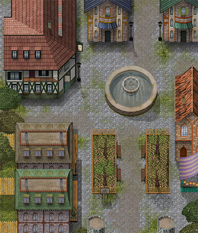
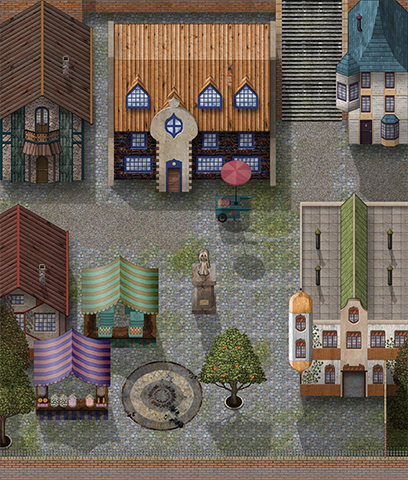
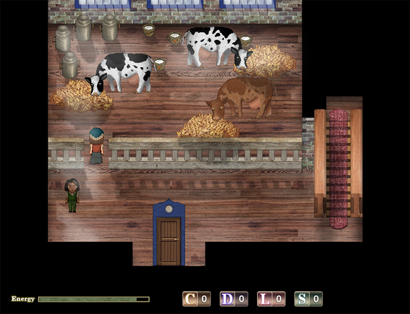
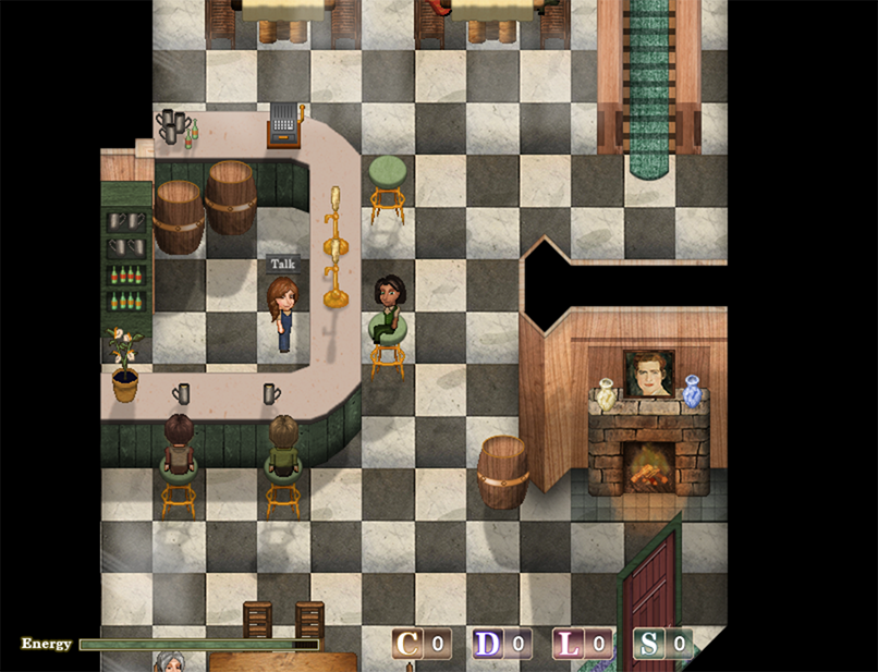
@ShiningPhoibe
I feel like everything might be a bit too evenly spread out?
Maybe try leaving slightly bigger areas of just grass, or the tall grass. (I assume the dark green is supposed to be tall grass anyway)
And clump together the big plants more? And the smaller flowers should be together too, but like, the same flower.
Something kinda like this?
Spoiler
Of course this is a way smaller map, but I hope you get the idea.
PS. I hate that MZ doesn't have a proper "tall grass" tile. There's just, weird moss or whatever that's too dark to place trees and bushes on, and leaves. (ugly leaves)
Thank you! It’s an open world adventure game but set in the confines of a single cityHere is the game’s thread: MZ - Deleted
I like your title screen particularly the character art. I wonder if the placement of the text and characters could be tweaked though as there’s a lot of empty space in the bottom left (unless you’re planning on putting some commands in there?)
Trying to make sewers with Kokoro's Reflection Sewer tileset. I wanted to make them maze-like and I think that part is okay? It looks a bit empty for now.
Today I have a Chapel of Wooden Bay.
Interior maps are even harder than exterior maps. This is just a base map, so any lighting and stuff will be added later. Suggestions for changes are welcome. :)
Today I have a Chapel of Wooden Bay.
Interior maps are even harder than exterior maps. This is just a base map, so any lighting and stuff will be added later. Suggestions for changes are welcome. :)
That’s very pretty and has a really cohesive style without too much repetition. Overall the layout and mix of objects and empty space is nice. Personally I tend to avoid making interior maps too much bigger than the building exteriors - I feel the proportions of your map match the scale of a larger church eg a cathedral rather than a chapel. I think generally we underestimate how big buildings need to be when making exterior maps, and vice versa for interiors. That’s a personal stylistic choice though and I know it can be hard to fit everything you need to into a small interior map.
View attachment 189584
Trying to make sewers with Kokoro's Reflection Sewer tileset. I wanted to make them maze-like and I think that part is okay? It looks a bit empty for now.
I am not a fan of sewers like map, so I hate yours by default. So great job!
If you don't want to make it look not as empty add some rats sprites, floating trash on water and such. It helps add to make the ecosystem looks a little better IMO.
@TheOnlyLlama Looks amazing! Apart from shadows and lighting effects (I just love lighting effects lol) I don't really have any suggestions. It's detailed without being cluttered. Your eyes, well mine, are drawn to the most important aspect - the road. You've done a fantastic job.
@TheOnlyLlama I agree with @The Stranger , aside from light/shadow it looks really good. Very much like the overall color-pallete too and a very natural feel to it in general. Good job!
Hi everyone, hope you are all okay and that progress on your games is going well. :)
I'm currently working on my battle system, trying to make it look visually appealing. At the moment I'm using a combination of Yami's Battle Symphony, Moghunter's Battle Hud and Yanfly Battle Engine scripts. So far, so good. All the scripts seem to be working fine together.
Still feel nervous about using sideview, I'm so used to front view battles because I find them easier.
I'm so used to front view battles because I find them easier.
For someone that changed battle views for the first time, you've done really well.
Nice hud, good to see the map in the battle. This is a nice simple battle screen. My only take on the downside is I found it hard to figure out where the enemies were and where the actors were until I realized it was a map battle background. Once players get use to that then it shouldn't be a problem.
And now (perhaps for the first time - I don't remember if I posted anything) I'm posting some insides on my game I've been working on for almost 5 years. (demo coming soon - still lots to do though).
Battle screen (from the test battle)
@dreamfall887 really like the design here. Very clear and easy to Read. Only 1 concern i might have is with no background behind the Bottom part it might get a little chaotic if the map gets more crowded with things on it.
But aslong as you keep An eye on that then yeah, looking good :)