Yes, I like the extra layers of treetops! As my preschoolers say while sticking out their hands and feet, "Four thumbs up!"
Game & Map Screenshots 11
● ARCHIVED · READ-ONLY
-
-
I tried to add some sort of shading to the upper layers, not finished yet but here we go anyway. I'm no pixel artist, but I think it looks pretty alright and adds some kind of depth. What do you think?
Spoiler -
I like the idea of breaking up the continuous flat top of the trees, but rather than the black border, why not just have another step/level of rounded tree tops?
Alteratively, you could break up the larger sections of trees with unreachable clearings inside them. -
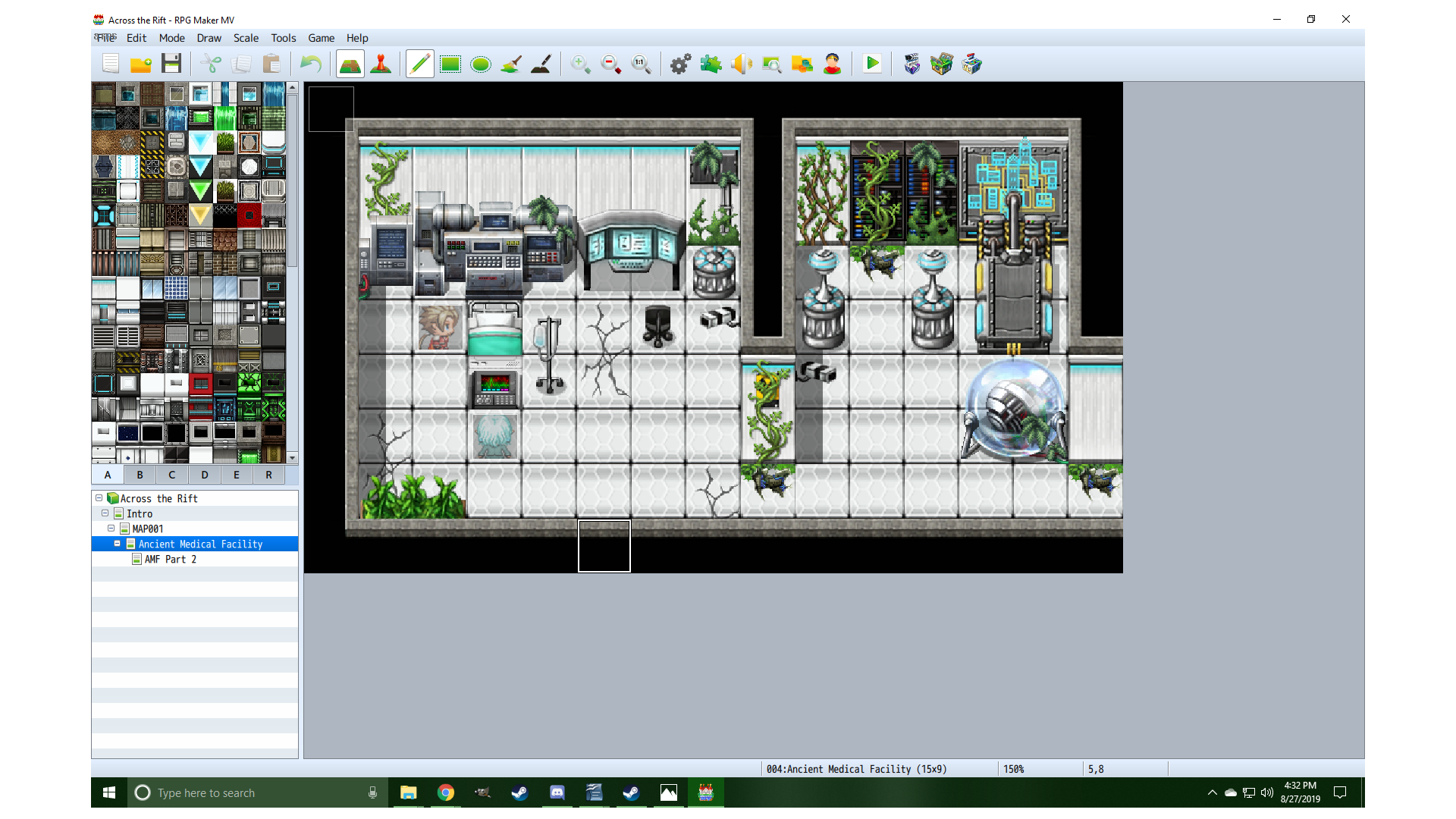
So I made this, but I want it to be more umm grungy. How would you guys recommend I do that? -
That link is giving a 404 error.
-
Could you upload it somewhere else?
I can't watch it. :eswt: -
yes, one sec
Fixed -
Alright.
So the grow over from plants is a good idea already. I would add some dirt around the ground and more small traces of the past and give it a darker look. -
You can probably get some feedback in the map/screenshots thread:
https://forums.rpgmakerweb.com/index.php?threads/game-map-screenshots-11.110530/ -
Is there any dirt/ grunge tiles in any sets I can buy, or any free sets to use to grunge this up more? and how would I give it a darker look? Gimp?
-
Maybe there is something what you looking for.
whtdragon's tilesets addons, fixes and more!
About the darker look, you could try out with lights and shades. Also edit tiles with Gimp. -
@Andreaus-Whitefyre I merged your thread with this one.
-
I don't know about existing tiles, but yes you can use gimp.
Use layers and brush effects with burn, overlay, multiply; and leaf brushes and/or textures.
Try looking in the resource section of places like deviantart, there should be some free to use brushes you can use to mimic the wear and tear.
When you can draw inspiration from real world references. There are entire sites dedicated to exploring abandoned structures and overgrown buildings that should give you some ideas.
Add grit along the open surfaces, particularly in corners and along cracks, where dirt would settle and stuff would grow. if plants are growing they tend to drop leaves which form mulch, panels get pushed out by expanding roots, glass is almost ever clean with dust and pollen, plastics may discolor, etc. -
@mlogan Thak you. I did not know exactly where it belonged.
-
Happy Wednesday y'all. Posting a screenshot with some updated assets. Tackling the pavement will be coming soon. I'm starting to gather a fair amount of assets for general map clutter, but I need to break up the green pavement next and give it some character. Now the solid green is just in your face. Still not much for shading yet either. Hope everybody has a good Wednesday.
Spoiler
-
Sadly I am not good with Gimp. I wish we had some dust and dirt stamps to use on the tiles in the game.
-
That moment when things actually look like they are coming together. I have posted this building before, but the screenshot was the asset within Pyxel Edit. This screenshot is in the MV editor and everything now tiles appropriately and has some level of shading.
Spoiler
-
I feel like this map is missing something, but i don't know what
-
Hmm, the bottom corners of the cliff should sit on the brown, rocky ground, not the yellow? Only other thing, maybe not line up the four trees in the middle? I like the tree graphics and your person is cute. *Squinting.* Are your cliff tops supposed to have less pattern around the edges? Maybe also the two cliffs of different heights (on the left) that have the same horizontal line could be shifted so they don't align, to help the 3D illusion?
-
@Oddball
What Xoferew said, the bottoms of the cliff edges don't match the rocky ground and sticks out. The other thing that sticks out right away is there is no depth here in the map. The cliff by the stairs could come down one more level and I see the tiles for the cliff aren't all correct either. Adding "layers" to the map makes it look more realistic (both in my opinion and from what I have been told).
