@Oddball I remember a video I ran across before on a game, and you can spend simply 10s of looking at someone's town in it here:
Go to 9mins:45sec into the video, and just watch for 10seconds up to like 9m:55s. It really made me think what can be acceptable in a game, for a layout of a town. The creator took a very different approach than most and it certainly made me remember just how different they chose to do it by having some of the shops feel more alive outside. It didn't feel like a repetitive thing, the shops faced differently, it was styled very uniquely. I'm not saying it's perfect, but it was certainly unique. I think this could be a benefit to take into consideration -- a game is meant to be enjoyed, so you have many ways of creating an atmosphere that can feel fun, or alive.
Game & Map Screenshots 11
● ARCHIVED · READ-ONLY
-
-
I'm trying to make a pixelated look for my game's title. While I'm sure neither will make it to the final game, I hope to see which of the two you guys think is best for now? Any other feedback is welcome too :) (it's an animated titlescreen btw)
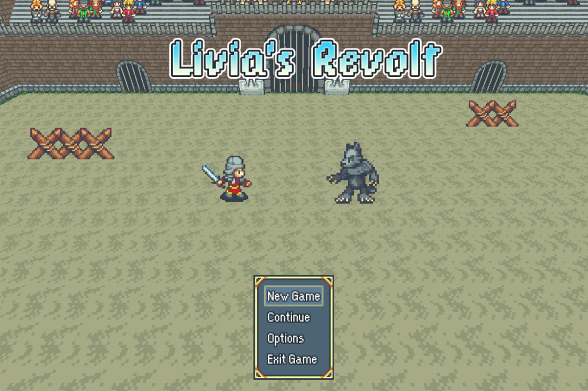
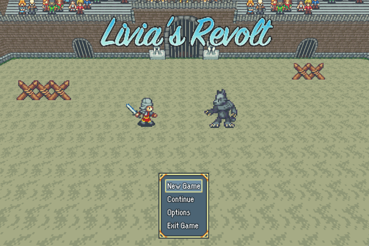
-
I like this oneI'm trying to make a pixelated look for my game's title. While I'm sure neither will make it to the final game, I hope to see which of the two you guys think is best for now? Any other feedback is welcome too :) (it's an animated titlescreen btw)
-
@Oddball
I like the pathways you did, they are nice and feel natural.
But I agree with what the others already said. The houses look too similiar and small.
On the Outside_C tab you have the exact same roof texture you used. Try to use this to make some L-shaped and t-shaped houses.
I would also always use at least 2-tile high walls for the houses, unless it is a small hut.
Here is an example I quickly did for the Outside_C roofs:
Spoiler -
Updated version of the temple map from The Cube Trail, thanks to @The Stranger and @Cardea . Everything is actually symmetrical now! (Ignore the offset portrait, that's a secret doorway, and I forgot to add shadows to the lower pillars.)
-
@cthulhusquid That is much better. Something I did to get round the problem of a map shot which displaced events was - just for taking the screenshot - I moved events up a tile so that they were visually in the correct place. Then I'd have to remember to move them back down again!
Here is what I've been doing.
Our intrepid adventurers are halfway up a mountain seeking the perpetrator of some dastardly deed (aka a side quest). Still have to put in the wildlife and enemies, but there are a couple of well hidden chests, as well as the obvious one. There is an exit on the left to a side map. Sadly I have never found a way of including the lighting etc., so there are also a couple of screen shots to show more clearly what it's like in-game.
Our hero has spotted one of the chests.
Admiring the view. Those clouds drift past at a nice speed, imo.
-
@Kes I like it! Have you considered placing patches of dirt\mud around? Other than that, I don't see much else you could add. Well, apart from lots and lots of sheep if my time in the Welsh mountains is anything to go by. :p
-
@The Stranger I know what you mean about the Welsh sheep! Sadly, they wouldn't survive here, as there are going to be wolves, rather big and nasty ones.
-
@Kes Could use more rocks that aren't part of the cliffs.
-
@Sharm Thanks for the suggestion.
-
I need to make a night variation of the kitchen window still.Spoiler
Spoiler[\spoiler]
The wall bit on the middle window needs fixing. I only noticed just now.

-
^ I'm a simple person, I see a ritual circle, I'm invested. I like the realistic room sizes. They seem to have just the right amount of stuff to fill them too without them being too cluttered or barren.
I've been working on this background and these enemies for this week. There has been something bothering me about this setup, but I can't quite tell what it it...
-
@cthulhusquid, I get jealous on your mapping skill.
@SoftCloud, nice to meet you. Wow, your house are really scary. I assume you make the horror game.
@orange~, love your drawing. Did you draw this yourself?
All of you are doing are great, I tries to find something wrong. But, I found nothing wrong. -
@orange~
I'm glad about the room size. :) I'm also invested when I see a magic circle. lol.
Ooh I love the integration. The background and enemies appear blended together nicely. I can't put my finger on what could seem off but perhaps the enemies could be less aligned? So they seem less like they are lined up. Not really a bother though, they look amazing!
Edit: I also really like your party members in this. Looks really cool!
@Kupotepo : It's a fantasy game with horror elements. :D Lots of creepy but cool monsters! -
@orange~ I really like the perspective on this one; it reminds me of Fear and Hunger, which I really enjoyed playing.
Giant amalgams of flesh definitely fit into a sewer; I'm always thankful of the men and women who have to work down there in real life. -
@orange~ I think what's off is the fact that your background implies a light source behind the grate (hence the shadows it casts) yet the enemies aren't casting any shadows from that same light source. Other than that, it looks fantastic.
Edit: Also, the angle each of each shadow cast by the grate implies that the light source is in an illogical position--somewhere midair between the expected source (the second grate further back) and the first grate. -
@Kupotepo yeah I've drawn it all. I'm glad you like it! : D
@SoftCloud yeah maybe it is a bit odd that blobs of meat would be so orderly...
@KakonComp well it is the sequel to Fear & Hunger, so it's no surprise there are similarities : D But yeah no kidding. Sewer diving must be one of the craziest professions around irl.
@Aesica you're right. I kept changing how the light eminates from behind the bars and in this latest version it doesn't make 100% sense. I really like the shadows casted on the ground, so I'll probably come up with a proper light source instead of changing the shadows. -
I wasn't 100% sure what you meant by this, but in case this is not the point you were making - at first I thought the middle window was an aquarium. That is because everything about it is at odds with the other 2 windows. I had to open an enlarged version of the screen shot to identify what it was I was looking it. Only then did I see that there is a semi-realistic view out of a window. This makes no sense at all. First because the wall at that point is several feet thick, so no window would be there anyway. Second because if this window gives a view of the outside, so should the other windows, and they don't. Third, the view is of the tops of trees, but there's no indication that this is upstairs, and you can't see tops of trees like that when you are standing at ground level. Fourth, the distinct light rays should be replicated in the other 2 windows if they were all being lit by the same light source.The wall bit on the middle window needs fixing. I only noticed just now
My suggestion is that either you remove the window there, or flatten the wall out and have the window be in harmony with the other 2. -
@Kes Much appreciated! I see exactly what you mean. I'll see about reworking that section. I'll more than likely do a flattening of the wall as I think it'll become more of an opened area. Cheers!
-
@Kupotepo
I used to be horrible at mapping, you just get better at it over time. Still, it's not necessarily easy, it just takes less time to get to the final idea.