I think, that's already a lovely start, I like the general look of it.
A few things: The chimneys of the gabled roofs look off. You wouldn't use a square end of a chimney on a diagonal roof. The bottom of the chimney should be diagonal as well.
I think, you are using FSM assets and they have tiles for that. Right next to the chimneys are the two fitting end pieces.
And I would try and make the walls of the houses of the bottom left and the one with the red roof 1 tile higher. Right now the roofs are very dominating.
Good point with the paths, @Kes . The lake is fed by a large river on the next map up! I can make the river in town more obvious though.
Oof, shadows, my worst enemy... thanks @cthulhusquid
Yes @Candacis the buildings are FSM tiles. I didn't see diagonal chimneys but I'll take a second look! Thanks for the advice on making the walla bigger, I'm going to try that. I think it will make them look better :)
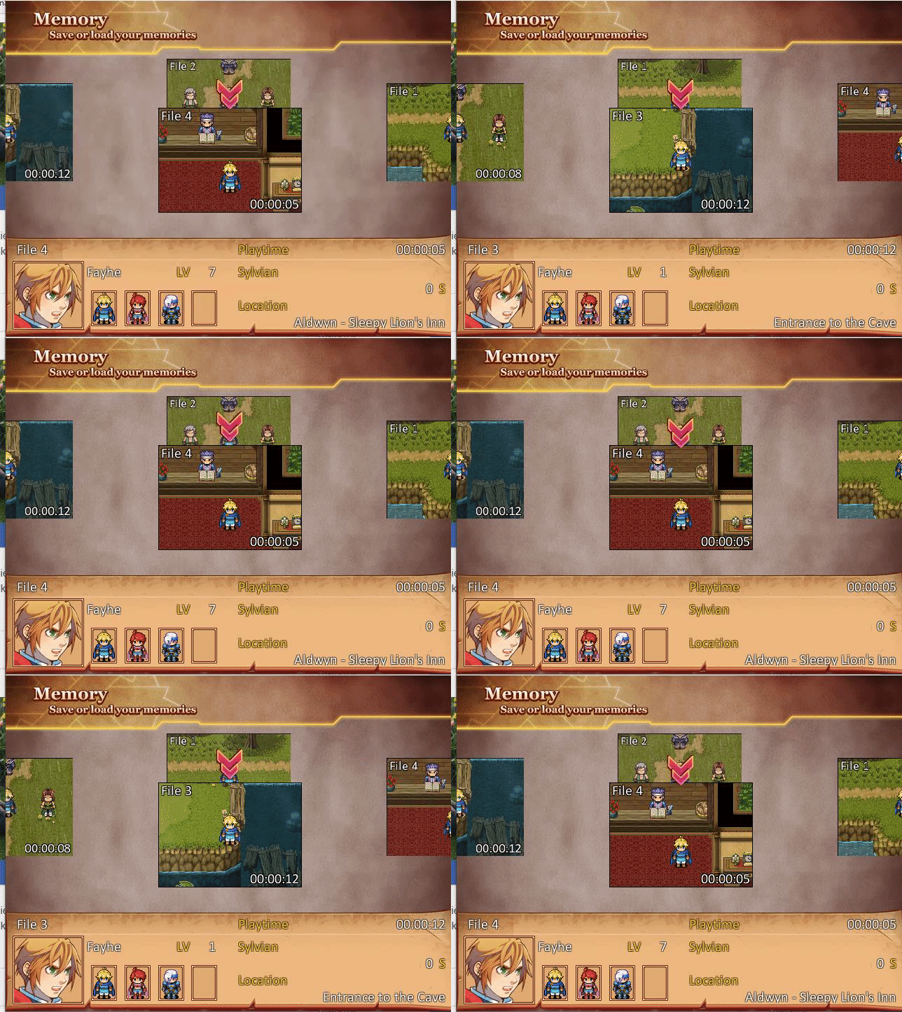
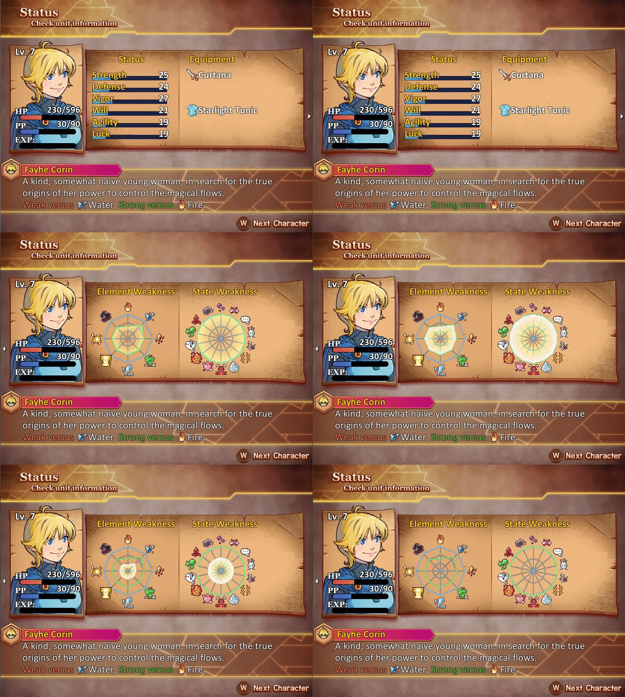
@BCj Ooh, I really like that status menu page! The save page took me a second to realize it was cycling between files; I kept wondering why there was a file showing behind. I would personally offset it a bit so the selected save file isn't sitting on top of another file.
I've decided to revamp all of the maps in The Cube Trail (game is not currently downloadable), because of the controversial thread about RTP-only games. To no-one's surprise, they look way better. For instance, the main town:
@cthulhusquid I don't think it's only a question of tiles, I think you've also become a better mapper since that first one. Your placement is more interesting. I'd like to make a couple of suggestions, though.
Your patches of forest/woodland could be made a little less flat looking by adding 'tiers' to those large black areas. Here is an example made with the same tiles. Sorry if it's a bit blurred, I did it with the snipping tool rather than go through the faff of doing a proper screen shot.
example of tiered trees
The other suggestion is about window placement. Some of those houses only show windows on the ground floor level, and I think they would look better if you also had one at the upstairs level as well. Here is an example of what I mean - there is a window above the door. I don't have a map with the same tiles as you have used, but the principle is the same. Once more, sorry for the slightly blurred quality.
@cthulhusquid I don't think it's only a question of tiles, I think you've also become a better mapper since that first one. Your placement is more interesting. I'd like to make a couple of suggestions, though.
Your patches of forest/woodland could be made a little less flat looking by adding 'tiers' to those large black areas. Here is an example made with the same tiles. Sorry if it's a bit blurred, I did it with the snipping tool rather than go through the faff of doing a proper screen shot.
The other suggestion is about window placement. Some of those houses only show windows on the ground floor level, and I think they would look better if you also had one at the upstairs level as well. Here is an example of what I mean - there is a window above the door. I don't have a map with the same tiles as you have used, but the principle is the same. Once more, sorry for the slightly blurred quality.
Thanks for the feedback! I like your suggestion of the "tiered" trees. As for the windows, I didn't add any second floor ones on the houses because none of them have a second floor. That being said, I can add them and just use them as another light source.
Thanks for the feedback! I like your suggestion of the "tiered" trees. As for the windows, I didn't add any second floor ones on the houses because none of them have a second floor. That being said, I can add them and just use them as another light source.
If they don't have a 2nd floor orabove, why are some houses so huge? One of them looks like it could have 5 floors.
Also, your doors aren't placed properly, try placing the event one tile higher. Right now they're half detached form the houses :p
If they don't have a 2nd floor orabove, why are some houses so huge? One of them looks like it could have 5 floors.
Also, your doors aren't placed properly, try placing the event one tile higher. Right now they're half detached form the houses :p
They only look detached in the mapshot, they are fine in game. The big one is a two-floor Inn, it just has a tall roof. The interior is pretty large so I like to make things scale a bit more realistically.
This is my 1st real map, it's the starting village's blacksmith's pad. The NPC behind the counter is actually the smith's daughter. This map doubles as the location of the game's 1st battle and tutorial to combat. (modified Lecode TBS w/ battles on the same map instead of being ported to a different battle map) I was going for a size that was spacious enough to move around in, but still small enough to be simple. (a brand new character can move ~3 tiles per turn) The battle occurs because assassins will storm in (from the back entrance) to kill the smith and attempt to steal the village's prized blueprints. The daughter will cower in the top right corner for the duration of the fight. The assassins will succeed in killing the smith (part of the cutscene), but you must prevent them from reaching the blueprints they are trying to steal on the bottom left corner of the map. The protagonist's dad will be present as well to assist you and act as a guide on the mechanics of combat. (Think Golden Sun: Dark Dawn)
Alternatively, I could omit the protagonist's dad and have the blacksmith's daughter jump over the counter and join the fray. She would act as the tutorial guide to combat instead. Thoughts?
Btw, are there any assets for blacksmith tongs, hammers, or grindstones?
@Kes , your ruins map looks great. The only beef I have with it is that the stream/river is too thin/small.
I'm just being nitpicky, but if there were once a people living here, that stream would not have been able to sustain the population. Perhaps that is why it is now in ruin? :p
@M.I.A. Sadly I have found it very difficult to make a stream autotile (because I want animated water) which falls between thin and the default wide. However, as this is, or rather was, a small military outpost, not a town, its population would never have been large, so I'm hoping the player doesn't notice.
@Ed19
This looks impressive, but I'm missing shadows. I don't know, if you are planning something with the lighting later, otherwise use the shadow tool in every right corner of the walls to give it some more depth. Like you would do with cliffs.
@Kes
What kind of tileset are you using? Looks like Celiannas Ancient Dungeons, but she has so many.
@Frostorm I see you're also using Kingthings Petrock Light. It's a nice font.
And yeah, those screenshots Kes has posted are using Ancient Dungeons tiles.
@Candacis The tile set is actually from several places - Celianna's Ancient Dungeons and Ancient Dungeons Jungle, with some editing, plus some heavily frankensprited fir trees & small bushes from Mack etc.. I created the ruins tiles out of a couple of bricks and an archway from Ancient Dungeons (yes, it took rather a long time!), stream autotile, the 2 flower autotiles and cliff vines by me, skeleton pile from RTP skeletons slightly recoloured and obviously arranged. Hmm, I think that's it.
EDIT, there is something else - the door archway in the cliff face is from Fantastic Buildings Medieval and the faint stone/grass autotile (not the floor tiles/grass one) is me.
@Sleepy Kitten Games As you can see, it's a bit more than just Ancient Dungeons.
@Kes Impressive, everything fits very well together.
If you are having trouble with the stream/water, send me a pn, maybe I can help. Have the set myself.
@Willibab For the actor sprite you use in the Menu, I'd definitely remove the shadow underneath it. It looks quite messy. My next thought depends entirely on how the equipment works. If that actor can indeed equip all those weapons, then fair enough. If he can't, I think that it would look much better if they weren't all listed, particularly as that would free up horizontal space for those line of extra information showing at the bottom. At the moment that block of info looks quite squashed.
@Willibab I hope you aren't going to release this for mobile lol. Running such a high-resolution w/ such a small font size, eeek. I mean your HP/MP bars are already like 1mm thick on my desktop monitor, I can't imagine it on a phone screen. It does look sleek tho, which is at least what you were going for. What did you use for your window skins btw? The modern-looking UI actually looks pretty cool juxtaposed against the retro game art.