Game & Map Screenshots 11

● ARCHIVED · READ-ONLY
Started by Celianna 2067 posts Page 19 of 104 View original ↗
  1. Chocopyro said:
    @BurningOrca
    Metric: Anytime I deal with the imperial system, I have to remember that only a small part of the world uses it, so I generally add metric in parentheses. It's not required, its just kinda a gesture of kindness to the rest of the world. But I mean, there's less of us than there are anyone else, so I don't really expect the same in return.

    Menu feedback: So far, I like how the menu is coming along. There are two slight grammar issues in Katrina's profile you might want to fix.
    Grammar Suggestions
    In line 3, I'd make a slight tense change to "or where she came from"

    And with line 5 the "Yet" in a strange place. You could either remove it like "but couldn't stay anywhere long enough to call it home."

    Or maybe just move it to the front, and change it to "and yet, so far she couldn't stay anywhere long enough to call it home."

    Thus far, like I said, it's quite nice to look at. It breaks the info down pretty well, and gives a lot of detail in the space that's used. The brackets are divided pretty efficiently, allowing the player to easily parse the info. And is that a friendship parameter I see? I love games with social systems!
    Kes said:
    @BurningOrca If we're doing grammar, it should be
    "accused of being a"

    and a nit pick
    "what adventures will lie ahead of them".
    You don't need "will" in that phrase. The adventures are already ahead of them, so the verb does not need to be future, as it is describing a present reality.

    Thank you for your feedback. English isn't really my strength. Having to do the game in english is quite a challenge. I expect lots of grammer/spelling mistakes in the future.
    I incorporated your feedback into the profiles, but I changed it to "or where she originates from".
  2. @CrowStorm : ahhhh, makes sense now. I guess I'm just the type of mapper who likes to stick with just one map type. the idea of areas within areas not being the same is one I've never really managed. lol. but if it's part of how your game world works then keep going, it's always interesting to have different ideas for how things work in fantasy worlds!
  3. Hello. First time posting a screenshot anywhere. This is just a single screenshot of a post-apoc game I've been working on for about 300 years. I feel like it's finally starting to really come together.

    SCREENSHOT
    screenshot.jpg

    I'm sure I'll be making changes to the UI, but otherwise I consider this a pretty much finished map. The characters (the guy on the horse, the horse itself, the other guy, and the werewolf) were created by others (Hiddenone, Whitedragon, Bis, and Whitedragon respectively), all other graphics by yours truly. The guy on the horse is the player (he can get off the horse, he just happens to be on it at the moment).

    The terrain graphic style (i.e. my graphic style) is NOT pixel art, while the characters obviously are, but I think it works. It actually kind of makes the characters stand out a little, and not get lost in the background. But that's just, like, my opinion, man... feel free to tell me if you disagree. Or if you agree. Or whatever.

    Obviously I'm using a parallax background, but several items (the trees, the sign, the diner, etc.) are actually events so that the player can walk in front of them and obscure them and walk behind them and be obscured by them.

    This is a 40x22 map, with a resolution of 1920x1056 (which should also be the size of the screenshot itself if you click it (I encourage you to click it)).

    That's all I can think to say about it.

    Thanks for looking!

    EDIT: Oh, woops. I forgot to mention that the graphics for the buttons at the bottom are from game-icons.net. Didn't want to not give credit where it's due.
  4. Oh, yes, the basis for my map was one of Jopac (J0pac's) RTP towns. : (

    I wanted to add a sad reaction to my initial screenshot, too, but you can't react to your own posts.

    (You're already featured in the credits of the game, Jopac, you're just not in the credits of that screenshot.)

    I meant to mention that in both my previous posts I just failed.

    Generally speaking for anything bigger than 20x20 I try to use sample maps or other people's maps as a basis whenever remotely possible. I am relatively good at making small, one screen maps attractive but I don't even know how to approach making maps over a certain size NOT HIDEOUS. Even if I wind up spending as much time editing the basis as I would have making something from scratch, even the basis winds up nearly unrecognizable as the final map, having SOMETHING as a base/template enables me to map large cities and whatnot: I could never have made anything like Praja from scratch. When I'm I looking at an empty map that's got to be like 40x40 tiles, I get totally blocked. I don't know where to start and so I don't start or when I do start, I hate the results after an hour or so so much that I delete the whole thing. Rinse and repeat. Rinse and repeat. Until I headbutt my computer so hard my project mysteriously gets deleted.

    So yeah, various maps in Malleus use the Sample Maps that came with RMMV, Jopac's RTP towns, FSM Town of Beginnings sample maps, etcetera, as a launching-off place. Again, in the game credits, didn't think to put it in the screenshot credits.
  5. Did some last touches before the early access release >w<
    HX16zbY.gif
  6. @dsiver144 Nice! The windmill and the wind turbines are cute and super smooth. I love the palette you're using as well.
  7. @dsiver144 Looks great! The colors are so vibrant but easy on the eyes, and all the little animations and particle effects give it so much life!
  8. @JDevain Love that grittiness and washed-out kinda of look in your map. Really sets the tone for a game like that. o wo
  9. Spoiler
    MAP027.png
  10. Image 1
    1579630384404.png
    Image 2
    1579630424931.png
    Image 2
    1579630476628.png

    Hello everybody, I'm here to ask; is this good mapping? cuz for some reason these maps look off to me, and I don't know what it is. Any comments on this or how to improve it?
  11. Map 1 from Orphan of Time:
    Spoiler
    Lizard Map.png
    This is a map of lizard village. Since I'm using time fantasy, its a tile best for open and uncluttered maps. The logs on the side is how I represent "door" on "open" maps. Though its not always the case. I may make a road instead if that'll look better.
    Map 2:
    Spoiler
    Town Hub.png
    This is the town hub. In this game, instead of having potion and weapon/armor shops in every village, there is one hub map where the potion and weapon/armor shops will update after every major dungeon. Instead of the dual logs, I put in a fence with gaps. And yes, you can walk behind the roofs.
    Map 3:
    Spoiler
    potion shop.png
    And this how I do interiors, in this case, the potion shop from the last map. Simple open and uncluttered. The way out is the break in the wall.
    What do you think of these? Any tips, tricks, improvements?
  12. @Shinguccci Pop Horror always looks really nice. You might want to use shift-mapping on the bottoms of your maps, that might help with making them look a little more natural. You might also want to add a little clutter, they look very sparse for spaces that people live in.

    @Mordridakon Your lizardpeople village is very square. You might want to move the buildings around a little, so they have a little more space around them. You might want to add roads, as well. Even very rural towns usually have dirt roads.
    I really like the idea of your shop hub, but you might want to use more colors for the roofs. It's very gray.
    The potion shop is really big. You might want to shrink it two or even three squares on the short sides, and maybe one or two on the long sides. Uncluttered is good, but there isn't much there.
  13. Windyhouser said:
    @Mordridakon Your lizardpeople village is very square. You might want to move the buildings around a little, so they have a little more space around them. You might want to add roads, as well. Even very rural towns usually have dirt roads.
    I really like the idea of your shop hub, but you might want to use more colors for the roofs. It's very gray.
    The potion shop is really big. You might want to shrink it two or even three squares on the short sides, and maybe one or two on the long sides. Uncluttered is good, but there isn't much there.
    I took your advice and made the changes you suggested.
  14. @Windyhouser Sorry for bothering you again but, may I ask what shift mapping is? I may have forgotten what it was lmao.
  15. @Shinguccci That's perfectly okay! If you hold down shift when you copy an autotile, you'll copy it exactly, and as long as you're holding shift when you copy it and place it, it won't tile.
    Quick example I made in the editor, left is default, right is shift mapped.
    Map015.png
    Here's a tutorial, too. It's a really useful skill to have!


    @Mordridakon Glad to help!
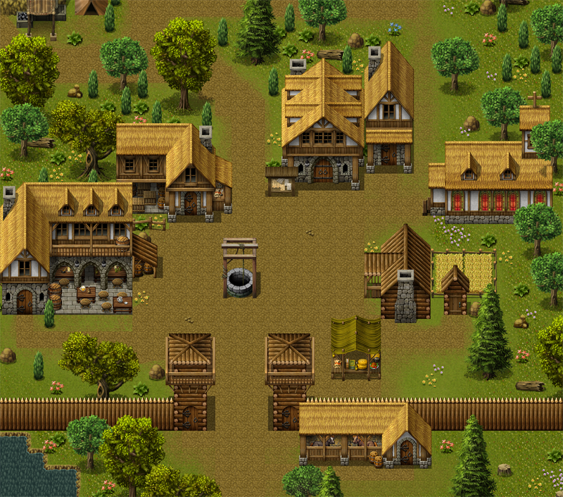
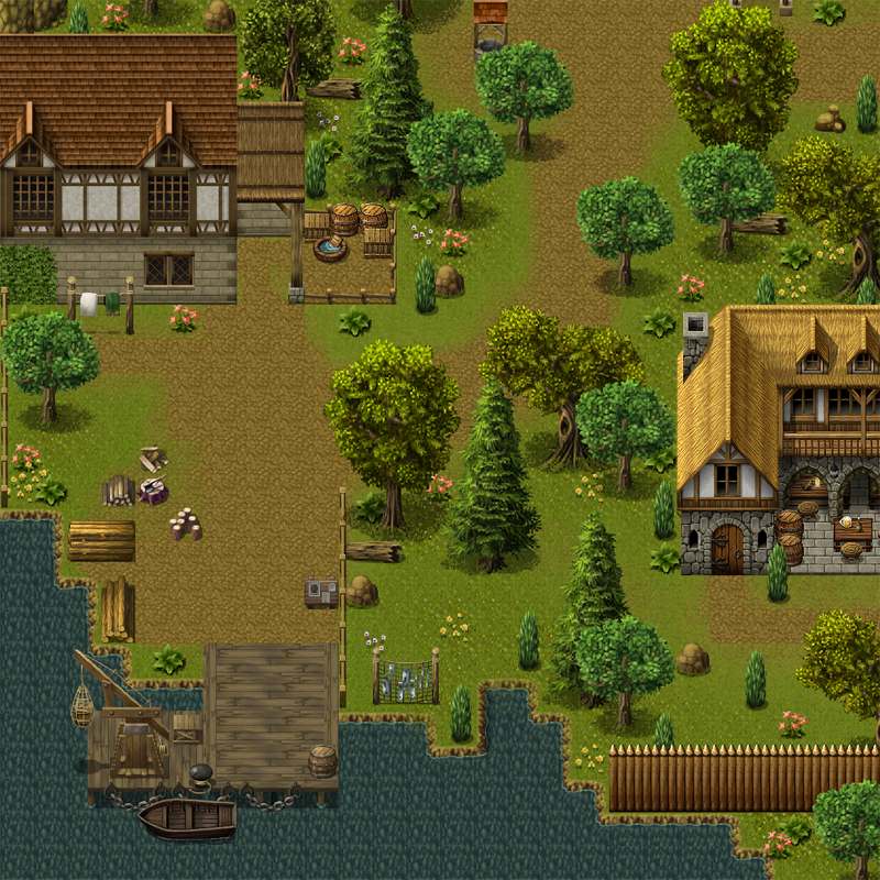
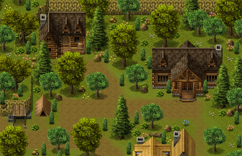
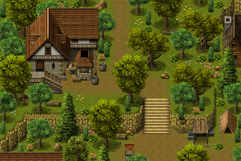
  16. Some images of Wilderwood, my starting town. A logging town in a densely wooded area. Truth be told, I could use some tips in making forest villages (Or forest maps in general) from anyone familiar with Celianna's ancient dungeon tile set, or the process in general, as I feel the town could still be improved, but ran out of ideas on how to do so. Other than that, the village was entirely done in photoshop, because you know that image saver. Some FSM tiles were used. (Namely the town square well, and the boat at the lumber yard docks.) No lore this time. Brain is fried from placing pixels all day.

    This is just one of those towns where you're likely to have a pack of deer in your yard, no matter how many palisades, or natural barriers there are.


    Town Square
    WilderwoodSquare.png

    The Lumber yard
    Wilderwood%20Lumberyard.png


    Bindheart Orphanage
    Wilderwood%20Orphanage.png

    Wilderwood Smithy
    Wilderwood%20Smithy.png
  17. awh_characters.png
    Ok, I know it's not technically an in game screenshot. But I wanted some feedback on my new character designs for A Witches Heart. I've been playing around the last few days when I doodled something that looked very like these on a peice of scrap paper and I rather liked the design.
    Feedback I'm looking for is on the colours, are they bold enough? Too much? (it's an artistic choice to have no shading, though its not 100% finished in terms of hair colour etc), general costume design, does it look Aztec like (the culture in game is based loosely on). Can you get a general idea of what standing each character is based on how they look (peasent, noble etc). Should there be more or less feathers?

    I need to know these things before I finalise them.

    Thank you!
  18. Looks a little more Incan than Aztec at a glance, especially the two in the red tunics, though I may just need to brush up on my Central/South American cultures again. If that isn't much of an issue though, and you're just kinda trying to capture the spirit of various cultures the same way most RPG settings do with that vague non-specific Medieval European flavor, then it looks good so far. The color consistency looks fine, but then again, I'm no artist. And now I'ma stalk your game, because just like Africa, the American civilizations and cultures are way too under utilized in RPGs, and I dig what you're going for. ^___^
  19. @Chocopyro
    Thank you. It's all thanks to Celianna's Jungle tileset and Aztec character set. The game itself is going through a revamp (since I discovered that my game files have all stopped working I need to redo entirely. fun fun. lol.) But the first step is the characters.

    I've also had a look at the Incan style of dress and I see what you mean. Thank you.