there is a nice image how to use stairs more nicelook, to make them 1x longer depending on the hight of the cliffs.
liket his image, but it also really depends on the user side of view:
there are some dev's, creators that change it maps often, maybe more than 5x :) while people inprove,
so does the maps as well.
@BurningOrca 'General Discussion' is never about giving feedback for individual projects, it is meant to be looking at broad themes which affect the making of games in general.
We do, however, have a thread specifically for feedback on maps, and I am merging this thread with that one.
Do you live in a city where the buildings are side to side with no space inbetween? *Shudders*
@Oddball: It may be that i grew up in a medium sized town (about 150k people) but i feel like if you fill any more space, it will look to crowded and loud. Don't fear empty space. Use empty space strategicly. Empty space in the right places can really accent youur game well
I grew up in a town with just 6 or 7k people, so no the buildings are not side by side with no space in between. I just thought the first version looks a litte boring, but the second version has trees growing out of asphalt, which I tried to avoid in the first version.
@BurningOrca 'General Discussion' is never about giving feedback for individual projects, it is meant to be looking at broad themes which affect the making of games in general.
@Kes: We do, however, have a thread specifically for feedback on maps, and I am merging this thread with that one.
Thank you. It is sometimes hard to find the correct thread for something. Maybe next time I'll start a conversation with you or another moderator and ask beforehand which thread would be correct.
It's physically impossible, so yeah, it's a bit odd when you look at it. You'd need to either scale down the front part of the wall to 1 tile high or scale up the rear part to 2 tiles high to make it right.
But if you like it that way I guess it's fine.
@TWings: I've now cut it down to one. @ShadowDragon: I've now extended it just a little bit, but not all stairs on all of my maps, because at some of them I thought it looks weird.
And I've shrinked one house in size, because it felt a little ackward. @Hyouryuu-Na: Using soil instead of the asphalt also seems to not look good on this map. So I sticked with the asphalt. That's a minor problem and I realized that it is a game, so it mustn't be realistic.
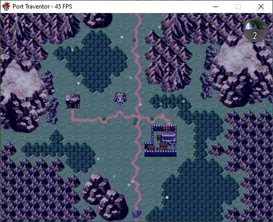
New Map
@Oddball: I guess my fear of empty space just comes from watching too many BenderWaffles videos. But actually I don't like his maps either as they always contain too many trees in order to close the space.
I've now also looked at a bunch of maps from this thread and realized that they always contain space. Realife towns also contain a lot of space.
So it is nothing I have to worry about and nothing that makes my maps look boring.
Thank you all for your feedback. I got a lot more confident from this. Thank you very much.
I think your town looks fine. Remember that you’ll be populating it with NPCs so it’ll get pretty crowded if you had to many buildings and things there.
As to the trees not set in a green area, why not edit them and add a pot below. I’m sure there must be large pots in resources somewhere, people do that all the time in real life so I don’t see why they couldn’t do it in game as well! Or replace the trees with statues or Collins, or something man made that someone in the town has made or something. Some slight tile set editing can work wonders!
@Tw0Face I like the overall feel of it. The floating head cursor...hmmm I dunno, not my cup-o-tea I guess. It's done well, but not my taste. I would prolly replace it with just a crown or something but that's totally my personal take on it xD Other then that I like the mapping and colors. Only other thing is the mini-map/radar thing ; it could be a little brighter as I didn't even see it at first glance. it kinda falls away to the background.
@Tw0Face map is oke, road at the right could be low while the intrance is there (if you look at the building) also, horizontal/vertical
roads seems a bit off, but you can try to make a bit more curve in it though.
Im bad at mapping, but I try to inprove to look at other maps to see where I can do better (but im not a pro at it)
because there are so many ways to inprove it.
During that time, I see what I can see and how to build a nice map :)
1. I finally got around to (attempting) a custom window skin, and soon the color scheme will be customizable by the player as well.
2. Sometimes, there just isn't enough space in the skill description window. :(
Well, HUD-time again, I guess. According to what @Finnuval said, I tried to increase the visibility of the HUD. This time I made it completely new to blend more with my system colors. I think it looks slightly better during night time. What do you think?
I need to test my event animations, music etc. & decided to video it.
Location - one of a series of linked islands on a foggy day (it's always foggy there).
What is being shown - you walk into an outdoor classroom for aspiring magic users.
All character names can be changed by the player, what you see are the defaults.
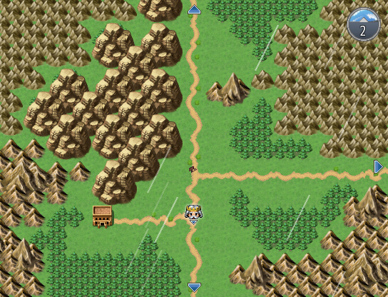
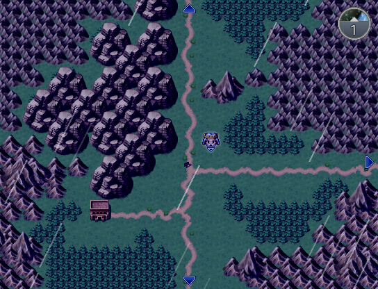
Okay so I'm trying to make a mountain pass that starts off slightly snowy and, with each screen change, gets more and more so as the party transitions from the temperate region to the cold northern region. And I hate how it's turning out so far:
Spoiler
The walkable parts should be fine after a bit of fine turning, but any advice for what to put in the "empty" parts that aren't walkable? (the large empty green areas) Caves are easy because I can just black those parts out, and if I was going up the mountain I could just abuse some background parallax thing, but since it's through a mountain range, I can't do either. Any thoughts on how to approach those empty spots in a way that sort of...de-emphasizes them?
@Aesica There's not a lot that you can do. They will have to be filled with the same sort of trees etc. that you have on the main pathway. One thing that does occur to me - going north makes it colder & more snowy, but logically, so should going higher. Those higher levels would have snow on them as well, possibly more snow that the Pass itself. So you could start introducing snow covered trees, logs, rocks etc. Snowy grass would also help. Which reminds me, there doesn't appear to be any long grass in the Pass. I think that the lack of ground variation is one reason why it looks a bit bland at the moment.
@Aesica One thing to keep in mind is that a player isn't going to see all of that empty space so you don't need to fill all of it in. Focus on the space you know the player will see with a block or two beyond that. Mountain passes often have ravines and little valleys nearby as well as boulders, large rocks and even pillar like shapes.