Game & Map Screenshots 10

● ARCHIVED · READ-ONLY
Started by Celianna 1970 posts Page 7 of 99 View original ↗
  1. @Kes I thank you for the feedback. One thing I forgot to mention is, this is gonna be a dark setting, one where you hunt creatures of the night (vampires, werewolves, ghouls etc.).People would be scared to go out on the streets especially at night and most of them would stay inside their houses or at the tavern as you said.

    This is pretty much the sunniest it can get during the day.
    day.png
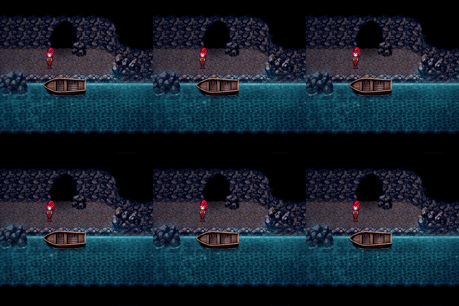
  2. A small gif from my project 'Ceress and Orea' <3

    cao_gif_water_by_plueschkatze-dc20t3u.gif

    @Skyquake I really like the mood you're creating with the colors. The bright grey stones could even get a bit darker I think.
    @Lycanimuss I love your screenshot. Now I'm super curious about that project. Do you have a thread or development blog or so? =3
  3. Im really impressed with that water, it looks super lovely.
  4. @Plueschkatze You're absolutely right about the alleys. I'll have to darken them a bit. Also I second @Alexander Hawksmoor 's opinion about your water . It looks stunning.
  5. @Plueschkatze I you want to add a bit of realism, the boat should be attached to something (a pole, a rock...) so that it doesn't go with the current on its own.
    And add oars :)
  6. @Plueschkatze Thank you, I'm glad you like it, many things about the project are still under development, for that reason still does not have a thread yet, but soon I bring more news! obs: I love you screenshot too!
  7. Another scene of my project. I'm not really satisfied with this but I'll give it a go unless this project would never be finished.
    PGo0lek.png
  8. I'm not really a big fan of the XP RTP but that does look quite nice. I would recommend maybe having some variation in cliff heights, and breaking up the flat back wall a bit. Some dirt in front of the temple entrance itself wouldn't go amiss either, since that's the logical place for the path to end. Maybe 'weather' the sign a bit too, so that it looks older than it currently does. Since the place is so decrepit it'd probably be a good idea to add more long grass around since it'd be overgrown, too.
  9. @Ksi Nice advices. Thank you!
  10. Couple new screens.
    Spoiler
    Here's the green room of a theatre:
    QT9WBan.png
    A boss in said theatre level - it's a malfunctioning animatronic that you fight onstage.
    2YSRl9Y.png
    A studio apartment:
    xm21043.png
    This one isn't an actual map, I'm just messing around with the color palette a bit. Might use it for a special sequence late in the game.
    vjWZFyP.png
    Thoughts?

    @callmedan - I like it, but I also agree with everything Ksi said. The lighter shade of the cliff at the southern end of the map looks a bit off too, but that just might be my preferences. Nice work.
  11. @callmedan On other point - if you follow the lower cliff top edge, you have missed out the little corner piece that you need to insert between each tile. You can see the gap between them. For example

    upload_2018-2-4_20-54-52.png
  12. @Plueschkatze that looks stunning! You're making amazing progress, super well done!

    @Lorenze I really like the style you're going for your game. Minimalistic, yet pleasing to look at! Personally I like your last screenshot the most! (though really they're all great, good job!)

    I've decided to post an interior map I made a few months ago. It is mostly finished (I just have to make 2 more rooms ). Every room is its own small map, that's why I seperated every room. I'm really glad my work paid off (I'm proud of myself) :kaojoy:
    But what do you guys think of it? What are your thoughts?

    Upper Floor
    Interior 1.png

    Bottom Floor
    Interior 2 (1).png
  13. @Rabosion Where is the entrance of the house? Is it the ?-marked area?
  14. It seems I forgot to make the layer with the front door visible, sorry for the confusion @cabfe . :kaoswt2:The front door is supposed to be on the other side (at the bottom of the room), between the carpet and the stairs. :kaoblush:
  15. Hi,

    I'm made a trailer for my game. I will release my game soon, but I'm not sure about the trailer.


    How does it look?
  16. how does this look for a starting town?

    town p1
    town p2
  17. @Abdulla Al-Farsi If anything, this trailer really made me interested about your game (and I am not usually into horror games) so that's probably a good thing and it means that it does its job. XD

    @gigaswardblade

    A lot of things can be changed about both maps. I'll list some of the most obvious things I noticed:

    1) There is a lot of empty space that is unneeded. You can make both maps a lot smaller or perhaps merge them together.

    2) There is too much variance between the buildings. Usually, a city/village would have buildings of the same shape unless it's a different type of building e.g. church, protection tower, castle, etc. In your case, it's a forest village so using wooden buildings only would probably make more sense.

    3) In a forest village, I doubt they would make paved roads. You should probably depend only on dirt roads in this setting.

    4) Dirt roads aren't so straight. ^^; They form more random shapes, cut off at some points, may lead to nowhere at times. In cities, things are different however because they are paved roads so they are more straight and have a definite shape.

    5) I noticed you have three cars around? They look out of place to be honest because that is not really the setting you would expect to find cars in. XD But if your game is set in modern times, perhaps you can work on showing that off a little? And cars would probably be on roads not on grass and all.

    You can look at examples of cities and villages mapped by other people. I think it could help inspire you more to improve your maps. ^^
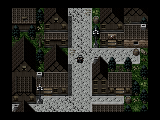
  18. @Miss Nile i tried to follow some of that advice. how does it look so far?

    town