Game & Map Screenshots 10

● ARCHIVED · READ-ONLY
Started by Celianna 1970 posts Page 43 of 99 View original ↗
  1. @Luke•°
    That looks awesome! Reminds me of Dark Souls in a good way.

    Here's some of my work. I'll make 2 posts for both games.
    The first one is Soulbound which features a bunch of different tiles/parallaxes.
    This was made purely for fun and to dabble with parallaxing.
    Spoiler
    Hell.png
    Hell2.png
    SkylandsofOra.jpg
    TheMisa.jpg
    TheMisa2.jpg
  2. Here's my latest game I've been working on called Unforsaken.
    This one uses only free assets and purchased assets.
    Spoiler
    My first town Sunvale
    Sunvale.jpg
    Sunvale2.jpg

    Coffee Shop
    CoffeeShop.jpg

    Dorothy's House
    Dorothy.jpg

    Darkside Caves
    DarksideCaves.jpg
    DarksideCaves2.jpg

    Darkside Cliffs
    Darkside Cliffs.jpg

    World Map
    WorldMap.jpg

    Second Town Virra
    Virra.jpg
  3. DizzyWolf, please avoid double posting, as it is against the forum rules. You can use the "Edit" function on your posts to add additional information you've forgotten or respond to multiple people. You can review our forum rules here. Thank you.


    If you want to add something after you posted, just use the 'Edit' button.
  4. @DizzyWolf Generally your maps look pretty good, but the coffee shop feels a little mismatched to me. You've got stone floors, wooden floors and then carpeted stairs, and then wooden stair banisters going into a completely metal railing. Could benefit from a bit more cohesion, cause the map has some nice details in it and I think it would look pretty great if it tied together a bit more
  5. slimmmeiske2 said:
    [dpost]DizzyWolf[/dpost]
    If you want to add something after you posted, just use the 'Edit' button.
    My bad. It's been a while since I've used a forum, but I'll keep that in mind next time ^^;

    @onipunk I see what you mean. Sometimes an outside voice helps spot little things like that. Thanks for the feedback! :)
  6. @DizzyWolf I really like the Darkside Caves maps. I assume those are FSM tiles. The trees that you use in Sunvale town I don't recognize - are those resized from another pack? I like em.
  7. Camping out in a spooky forest. This is actually going to be my game's opening scene. I'm using the Terrax lighting system for the darkness and campfire effect. Here we see our three protagonists, Amara (Right), Torin (Top left) and Celia (Bottom left) convening around the fire.
    Zco1jRn.png
  8. @jonthefox
    I'm not sure. Pretty much all of my assets were bought on steam. I think it was from the town of beginnings tileset or something along those lines. I'm at work right now or I'd just look them up xD
  9. animated screen
    capture3.gif

    I spent like all day, figured out how to make blinking text in a window :)

    readjusted center
    upload_2018-7-25_2-11-56.png

    I get confused about coords because of all the separate values.

    I'ld like to create an animation of a coin going into a slot like at a arcade, and then dispose the flash window and start up a window for options :)

    day by day ya?
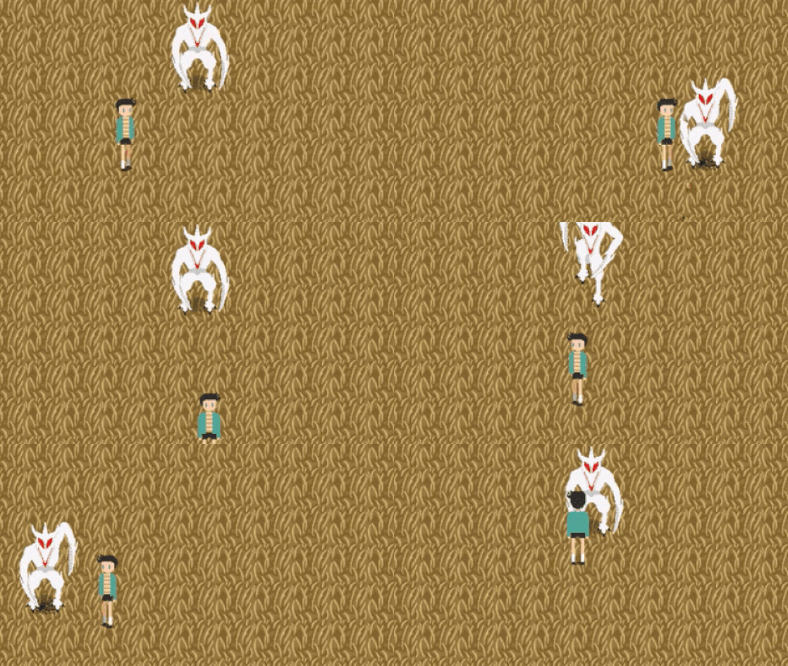
  10. My project features a combat system that made with events and this is a test for a move of the final boss.
    giphy.gif


  11. I just finished up the trailer for my new game, would love some feedback. :D
  12. sup guys, some months ago i switched to Lecode tactical battle system (its awesome!) so i started doing some battle maps, as usual focusing on modularity. This one is a 50x50 map.
    otDiSZx.png
    44f7HcK.jpg
  13. @Amarok that looks like it took tons of hours to draw and implement. Just amazing work. I assume the enemies are base templates, but still nice. Just maybe if there were some rocks?
  14. @chungsie thanks! actually there are tricks to make the process go a lot faster, specially if you dont mind reusing stuff as if it was a tileset.
    More rocks may not be a bad idea, the map could use more details indeed.
  15. @Amarok I really like the spritework there. Would it still work if the map was a little smaller? Unless you're planning to have more enemies and allies in this scene, it seems a bit big and empty. Ading more details to the map and interactivity with the terrain would be another alternative. It looks beautiful.
  16. @Crystal Flareon thanks! yeah it works on big and small maps, in fact i want to keep most battles on smaller maps and have the bigger ones act more like exploration maps, where you could find treasure, materials to collect, enemies etc
  17. @Amarok I don't know what I would do without LeTBS in my life and your game looks very unique, hardly looks like an RPG Maker game at all! Can't wait to play a demo for it
  18. Hello everyone, first time posting in one of these threads in a while and I'm hoping more some feedback and advice on a map I'm working on. It's a fantasy setting academy/guild hall. My problem with it is that it feels too empty (I struggle with this on my indoor maps) and I was curious as to what other things I can use from the RTP to make it feel less empty.

    Academy WIP
    go2unjH.png

    Any other advice on how I can make it look better would be appreciated too. Also I feel like I should mention that I have added windows after having taken this picture, so disregard that if you will :)
  19. @EtsuaCoil you're exactly right, it is a nice map but there's way too much empty space.

    let's start from the bottom up. walking into the first part, the space between the walls is good, and the walls are decorated nicely by the banners - you may want to consider having paintings, stone tablets, or some mounted weapons/armor for variety, but this is a small issue. the main thing here is that you need to fill the bloor! you don't need to be a pro mapper for this, just throw in some barrels, crates, urns, chests - it looks very odd that there is just empty space all around.

    moving up to the middle section is the biggest problem with the map - the room is WAY too big! you can simply take away 2 or 3 tiles of height, and you can reshape the sides so you don't have those big bottom corners of blank space.

    as for the top room, again - you can add in some barrels/urbs/crates/chests to make it look less empty. and maybe some windows here?

    hope this helps!
  20. Firstly, I just really want to say that after going through the majority of the 44 pages of this thread, that... Dayummm!!!! There are some serious legendary, diverse, imaginative, and incredibly talented Artists and Storytellers here, I love how every game is so unique and different in it's own way, even when everyone is using the same Engine. Amazing, great job, pat on the back, and I'll definitely be looking to try out some of these games!

    My thing is Horror, not a unique genre, but I have many years of Horror experience to work with. most people would think RPG Maker games just aren't creepy, or scary, but I'd like to show that they can be just as creepy... My game is called There Are Voices.
    I've put a lot of time and effort into details in my game, there are quite a few different locations now and I have tried my best not to duplicate assets. Here's a few screenshots, I'd love to see any kind of feedback good or bad, but hopefully constructive. And I'd love to return the favor when possible.
    Spoiler
    1.PNG 3.PNG 4.PNG 6.PNG 7.PNG 9.PNG