@9tkitsune Members can't delete posts. I will, on this occasion, hide it for you.
Game & Map Screenshots 10
● ARCHIVED · READ-ONLY
-
-
The characters and doors are events, so idk how to reflect them it should be a plugin or something...@RocketKnight If you show reflection on the floor, everything has to be reflected. Now it looks half done.
-
I will try this screenshot - posting thing again, maybe it works this way : ) -
Slowly working on something... very slowly...

Clerk-Bot is eager to help! -
Hey everyone! Here's a skill animation!

-
@jonthefox
SpoilerKeep in mind the ceiling tiles are the same height all the way around, so you need to make the lower walls that touch both ceiling and bottom floor two tiles higher to account for the difference between the two floor heights. That is, since you're going up two tiles, but keeping the wall height on the upper layer the same height as those on the bottom layer, you need a way to show that height has been added to the walls that still connect from ceiling to floor.

Because the ceiling (pink) is the same height, you need to make sure that walls going up or down levels are equal all the way around when they reach the bottom floor level (green). So in this case the stats of the room are, in tiles, 7x8x3 (width x length x height). The height is three, so you have to make sure that all walls equal that from bottom floor to ceiling when counted in a vertical line.
In your screenshot you have a room with four height as total, however some of the walls are only two high when counted in a vertical line.
Now for something I've been doing instead:

-
I started finally a new project after a long time.
This is one town I made, I try too keep it in an kind of old school style like the old snes rpgs.
I used Celiannas Ancient Base Pack for this, worked really well.
-
@Ksi wow i can't believe i didn't notice that! thank you. do you think the cliff edges look okay though?
@Lornsteyn if going for an old school style town like snes rpgs, i'd say you did a pretty good job. a couple things...the empty space around the town stands out, i would decrease the size of the map so there's less of that, and/or populate it with trees. also, your trees are very sparse, and don't really fit in with the style of the old school town design. their trees were smaller and more numerous - yours look more realistic in scale, but there's a lack of congruence here. -
@jonthefox
Thanks.^^
The empty space around the town is intentional so the camera is still moving and not stopping like it would usually do if you reach the end of an map, the player will not notice most of these empty space since he will transfered if he leaves the gate. -
Completed my introduction map. Basically it's just being used for one cutscene at the beginning, so it's going to be looped. I wanted to move the trees up a bit so they would far away from the rocky edges, but the tileset is already full so I didn't know where to move them. o_O
What I am worried about is the shadow underneath the trees. Probably going to have to erase them in Fireworks, since they look really weird at night. I'm thinking of adding light posts around the place, too. Not sure if that would be necessary. :rolleyes:
Spoiler

-
Been working on fishing system for 2 days. It's very hard to catch fish. :blink:
I think I'm gonna have some internal pain when fishing in your game -
@Yoraee We usually call that a skilled animation. Only skilled animators make those. :D
-
@Knayter Maybe lol. I was testing the hardest mode in that video. In the first build, it took me over 5 mins to catch a fish. xD
-
I am working on parallax mapping for the project i'm developing. Currently trying to develop a port city, of which this screenshot consists. Feedback would be appreciated!
-
That looks great. Kind of gives me, an old adventure game vibe.
@Yoraee I had not said it before, but that is incredible.
I had been working on playing with animating skills, though I don't think I've got a good grasp on this yet.
Spoiler


-
Took a break from my main development. Doing an game making event, but I have also been going through old game files and pulling all these old maps to spruce up into an RTP game since I had a bunch of test games. What game is completely without a lonely mountain house... who lives here?
Lonely Mountain House -
Need a little feedback..
This is what my shop used to look like, but I found it uninformative, as it only listed +attack:
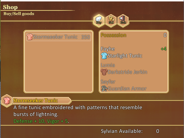
Then I found a scriplet that offered more info (don't mind the jumbled text - I didn't fix it:
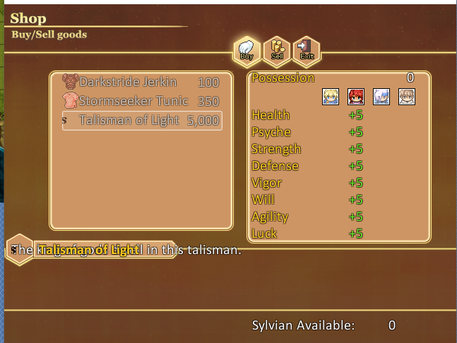
But I found it hard to read, yellow on yellow. Yellow is my system color.The rgeen was a bit ahrd to read. So I tried to experiment a bit and came up with:
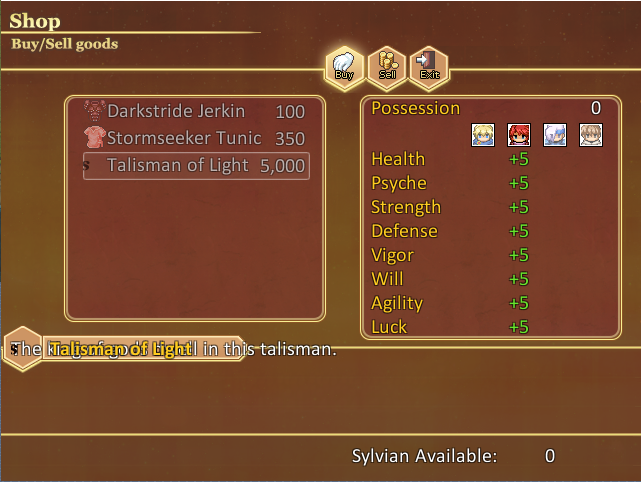
Easier to read, but now I've heard the red doesn't fit. Any tips to make it better readable and looks visually nice as well? Getting stuck here. -
Easier to read, but now I've heard the red doesn't fit. Any tips to make it better readable and looks visually nice as well? Getting stuck here.
I think the red fits pretty well. Though you could try out the colour in the very top of the background if you want it to blend in more with the rest of the colours while still being dark enough to read the text easily. -
@BCj Same here, no problem with the red.
If you want to try another color, what about using the same as the lowest window (the description window) on your screenshot? -
Trying my hand at making a battleback.:unsure:
Going to use a plugin to make the clouds scroll in the background. It's all made from bits of RTP.
Spoiler
