@Labyrinthine Those tiles on the walls and floors look advanced tech, high glazed tiles, which clashes somewhat with the more medieval character art.
Game & Map Screenshots 10
● ARCHIVED · READ-ONLY
-
-
You're right. The game has one important area which will look like that, though.@Labyrinthine Those tiles on the walls and floors look advanced tech, high glazed tiles, which clashes somewhat with the more medieval character art.
-
how does it look now? -
Can anyone give me feedback? I'm not good at making castles. I can do tiny homes just fine but I don't know how to fill up all of the space in this area and I'm afraid if I make it smaller it won't give the impression that the owner is filthy rich. This is also supposed to be a modern mansion. Also I know the lamps are asymmetrical, I just haven't moved them yet. :o
-
@KerriganSaila Maybe consider breaking up the larger room into smaller connected rooms which I think can give an illusion of a large estate if you have enough of them. For instance, the average single-family home will have 5 to 6 rooms (3-4 bedrooms, living room, kitchen, basement). However, a mansion may have 10 or 12 or more rooms depending on how large it is.
You don't have to necessarily make 10-12 maps but maybe make the kitchen a separate map and the den a different map, bathrooms, etc. The benefit to having multiple maps too is it encourages the player to explore. -
im gonna take that 1 like as an "its perfect. don't change a thing".
-
I think it looks great :)im gonna take that 1 like as an "its perfect. don't change a thing".
-
@gigaswardblade I wouldn't be quite so quick to assume that, it might just be that people haven't the time to post a comment yet. Here are a few things to start with.
Take the houses in the middle row. Their back walls are slam up against the cliff face, so no windows, no ventilation, cold and damp seeping in from the cliff face. No one would build houses like that. They need to come down at least one tile, probably 2.
The roof of the wooden house at the left end of that row is wrong. I am assuming that you want to make the house look deep, but using a slanted roof tile means that you have made it look tall. Not only is it out of proportion, but unless the roof drops in a straight line down, how does the back half of the house manage to fit in before it hits the cliff?
I am aware that most of that forest will not be in the player's sight. However, in the areas nearer the village, please put in some spaces among the trees. Not only would that give a bit of visual interest, it would also make the forest appear a bit more natural.
The houses on the top row have the same problem as those on the middle row, except this time it is trees, not the cliff face. Take the trees back a tile or two, so that there is a gap between the houses and them.
Your flat roof houses do not have any chimneys (there are some on the default tile sheet for them), so it implies they have no fireplaces. Are you giving those houses central heating?
The way you have the black car parked would be almost impossible to achieve except with a lot of maneuvering. People would park it vertically, not horizontally.
Why does the path stop so well short of the stairs up? Why is there no path on the top level? -
Hello guys!
How look my map?...This town is so called "Wigston Town"
Later, i will add castle in wigston town. -
WOW! That's huge!Hello guys!
How look my map?...This town is so called "Wigston Town"
View attachment 87768
Later, i will add castle in wigston town. -
@DarkHunter It's really big. How does it look like in game? It might be boring if you have to walk around a big map.
-
Also it could cause A LOT of lag.@DarkHunter It's really big. How does it look like in game? It might be boring if you have to walk around a big map.
-
Custom tileset and charset for my new project. Thoughts?
Spoiler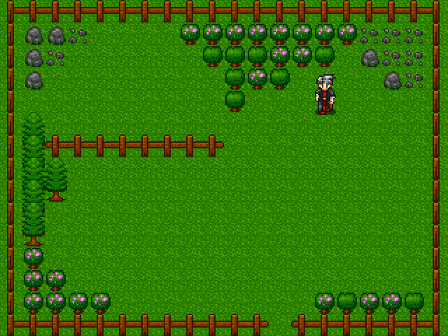
@DarkHunter your map is cool, but way too big. It might lag on low end PCs. You should divide your town in smaller sections. :wink:
@KerriganSaila the mansion seems fine for me. Just fill it with more vases and statues in the lower part where's more empty, to make it clear that the owner is rich and expends money in futile stuff. :wink: -
@DarkHunter Wow! That's huge and flat. When I make slightly larger maps, I try add water (river or a lake) and cliffs and various height to add more depth to it. Of course, I think you could cut it down, as my largest map is 50 x 50, but it doesn't feel empty, at the same time.
-
@DarkHunter looks pretty good, but the first thing i notice is...it's so BIG! Looks more like the size of a large city in a jrpg, not a "town" - i worry that the player will be overwhelmed. This also makes it a bit repetitive. Also, with the scale of your houses, it looks a bit odd that all the trees are so much smaller. This isn't really your fault, and you used the RTP well, but it's one of the limitations of the RTP tiles.
-
@callmedan Yes, I can walk with fine. Later, I will make to full version in my game. You will make happy for fun :D
@Thomas Smith Dont worry, i will find fps in ur computer but i'm tired to find fps.js :(
@Caitlin Just try to make biggest map as like me... :DD if you cant make that. So nevermind. I'm fine for make (big map)...hehe
@jonthefox thank you!! i just use RTP tiles with fine. If i make draw for RTP tiles like confuse @@....Dont worry, I'll watch youtube Echo for learn :D
@CleanWater Sir, dont worry, I can find fps.js for fine with ur computer. But i cant find "fps.js"....
Nice Map! Did you make draw that map by yourself? -
Hey guys. Just finished working on my main character sprite. How it feels? Does it blends into RTP ? I welcome any tips and feedback. Thanks!
-
@GuanyuMaker I'm not sure if it belongs this maps screenshots section, but to answer your question, I think your sprite needs its colors to be more saturated to match the RTP style.
-
It actually looks great!Hey guys. Just finished working on my main character sprite. How it feels? Does it blends into RTP ? I welcome any tips and feedback. Thanks!
I do agree with @cabfe. -
@DarkHunter Yes, I did the tilesets and also draw the map. :biggrin:
@GuanyuMaker what a great pixel art job! It blends perfectly with the RTP tilesets. :smile: