Ah, sorry. I don't have any project, just want to show my work.
Fell free to moved it if this in the wrong place.
Game & Map Screenshots 10
● ARCHIVED · READ-ONLY
-
-
I haven't posted here in a while, so here's the prologue area of my game. The guard at the bottom needs his shadow resized, but yeah.
Cardinal Egress - 27F
-
I'm having the most troubling time creating a garden for this mansion. Maybe it's the lack of snow tiles? Any ideas?

-
@StrawberrySmiles There aren't that many flowers that bloom in winter anyway...
But I have a question regarding the big non-totally-square areas on the left half.
- Why are they not square?
- Why are the hedges so high? People can't see the flowers. A lower bordering like the for the blue flowers in the top right is enough.
Also, is there a reason for such a high wall on the left when the hedges are only 2-tiles high? -
@StrawberrySmiles There aren't that many flowers that bloom in winter anyway...
But I have a question regarding the big non-totally-square areas on the left half.
- Why are they not square?
- Why are the hedges so high? People can't see the flowers. A lower bordering like the for the blue flowers in the top right is enough.
Also, is there a reason for such a high wall on the left when the hedges are only 2-tiles high?
It's a fantasy world, so flowers CAN bloom if I wanted them too. :p
Cause I looked at fancy gardens and saw non-square stuff. The left-side is the mansion? Like 3 floors high.
But I still don't know how to fill up the garden... -
@StrawberrySmiles Things like inactive fountains (the water won't be flowing in winter), snow-covered benches, a patch cleared of snow because a snowman has been built on it which used the snow just there.
On a different note, the trees at the bottom are too close to the hedge. There would be no room for their trunks and roots, especially the larger one on the right, which would have more of it's trunk showing - it should be a lot taller than the others, going by the size of the leaf canopy. -
@StrawberrySmiles
Big blank open area looks a little awkward in comparison to the rest of the map layout. -
-

The family who runs weapon shop sometimes has the mother take breaks to hang out with the father. That's when the daughter who works there part time fills in for the parents. -
@Tuomo L There's something of a mis-match with a few of the things on the map. Curtains like that look odd in a working weapon-making shop, as do gilt candle holders on the wall. Both of those would be more appropriate to a home.
There appears to be no light source in what I take to be the workshop area (bottom right corner), so how does the weaponsmith see to make his weapons? Or maybe nothing is made there, because that stone floor has never seen hard work done near it. It needs to be scruffed up a bit. If that is meant to be a furnace of some sort, then the floor around it will be heat blackened, and you need a water trough.
How does anyone get to the weapons on the back wall when the way to them is blocked by boxes of sharply pointed spears etc.? A shopkeeper is going to want to be able to reach for, and demonstrate the good qualities of, their produce without having to call in the furniture movers. Put this alongside the other points, and overall the impression is not of a genuine weapon shop
If you're wanting feedback on a map, it would be helpful to have the map without an enormous figure covering up such a large section of it. If you were wanting to display custom characters, then such a shot would be justified, but as I think this is a resource pack one, it only serves to block the view. -
@StrawberrySmiles You should add some boulders to that garden; they're nice and ornamental. :)
Buhh I could use some help on this highschool library map. Adding more bookshelves is kinda... meh. I'm thinking about having a long row of computer stations in that empty section of the map, but it still feels really bare. It feels less bare at full-size but still.
Spoiler(click it for full-size; iso makes it look so tiny)
(empty bookshelves will have books in them, I just haven't tiled them in yet (yes I made tileable books because apparently I am a masochist))

Any thoughts? =T -
@Tuomo L There sure is a tonne of wasted space in that map. Most smithies also had the forge outside of the store, you know, because the buildings were made of wood and forges generate a lot of heat...
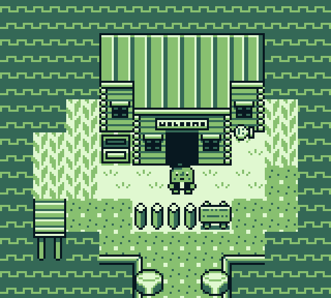
My current projects maps are all currently the exact same size to capture that Links Awakening feel. Heres a little house in a secret area that houses an optional boss. :o -
@ashikai A librarian's desk at the door so that people can check out/in books is needed. But if you feel that your map has a lot of empty space that you can't fill, then reduce the size, rather than hunt around for clutter to put in it. You could have some computers there and still reduce that large area on the right.
-
@ashikai The isometric tiles look great. Another option could be to fill the blank space with reading desks. Also, should there be a librarian desk/counter since it is a school library?
The North side of your tiles looks a bit off in a few places. One of your power outlets is overtop of a sofa, when it should be underneath. The right edge of the sofas also look off next to the left edge of the bookshelves because they line up in a way that tricks the brain in an unfortunate way due to the perspective. Is it possible to move the shelves closer to the sofa and have them overlap? Alternatively, you could increase the space between the sofa and the shelf so that the lines don't run together like they currently do. -
@ashikai I wish I could learn how to ISO :)
-
@Marquise* No you don't; it's a right pain in the butt. I question my sanity daily. QAQ
@Kes I was thinking about making it an office instead but you're right; it's hard to check out books without a checkout counter. The problem with the map size is because it's an iso tile on an orthagonal grid I have to leave a lot of space in order for the player to be able to move in a way that's not stupidly frustrating. Diagonal movement moves you at 45*, whereas iso tiles are done at ~33.7*(ish), so you can't walk a straight diagonal line down the hallways without eventually colliding when navigating via a normal keyboard. I did cut a bit area out at the bottom though, replaced it with walls and a doorway that'll serve as the entrance to the computer lab. I think that'll work a bit better than having the computers out in the open. I may not even need to make that map.
@mauvebutterfly yeaaaaa I got my tile layers all messed up. I messed with the couch placements a bit and couldn't get something that looked ok, so I shrunk the sizes of the bookshelves and just added more space on either side. I think it works, but I dunno. I've been staring at this for a while. I also updated the carpet tile so it's textured instead of a flat color; hoping that adds a little more visual interest.
UPDATED LIBRARY
Spoiler(still need to put in the books, a computer for the librarian, a search/card cateloge computer station, office chair, and some assorted desk items)

@VisitorsFromDreams Aw man; the good ol' days of green gameboy screens. Your nostalgia factor is killin' me. :D -
@ashikai That layout works much, much better, imo. Just make sure that the librarian can get behind the desk. At the moment it looks like both ends go up to the wall.
EDIT
Though maybe not - is there a gap at the end nearest the couches? It's difficult to tell at that scale. -
Going for a bit of a strange setup with this project, looking for some feedback on ratios and the overall feel.
Spoiler
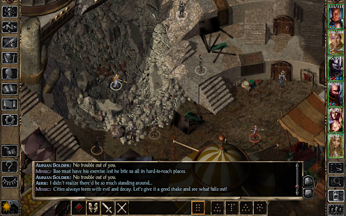
I want to recreate the feel of the old Infinity Engine, which had permanent panels at the bottom of the page / edges of the page which would contain all the dialogues, location info, UI, etc. Here's an example of what I'm going for:
Spoiler
It's not going to be the exact same thing, but that black box will be used for most of the UI. As for the actual locations, they're more of a visual guide than an explorable place, as it's going to be more of an adventure / management / strategy game, a bit of a weird mix, I know. The only functionality they'll need are things like places to visit (where you just do menu stuff) and people to chat to / get quests from. This is an example of a city screen in another game, Battle Brothers, that has similar functionality:
Spoiler
I was originally going with a 2/3 for map and 1/3 for the box, considering making it a bit smaller, but I don't know, I just sort of like the ratio atm. Any thoughts? -
@CrazyCrab thats a really neat idea. On a side note, with the your assets and perspective it reminds me a lot of the old beat em ups like Double Dragon. The idea of an rpg thats half way between full side scrolling perspective of Lisa and the usual full top down perspective we usually get is pretty interesting I think.
-
@Kes yeah, there's a gap on the right side that's big enough... S'not super obvious though, so I'll make it bigger. o3ob
Thanks for you help! :D
@CrazyCrab I'd make the back box a little smaller, or change the screen resolution a bit. Right now it looks very 50/50 even though I measured and I know it's 2/3 1/3.