Looks really cool but I am afraid that some player may find it a bit too murky. Depends on what the map is used for though. Welcome to the community!
Game & Map Screenshots 10
● ARCHIVED · READ-ONLY
-
Looks really cool but I am afraid that some player may find it a bit too murky. Depends on what the map is used for though. Welcome to the community! -
Spoiler
-
Changed the way mouse and arm rotation work. The default angle now has to do with the direction of the player. The light can rotate further when I click my mouse. Additionally, the player's main body changes according to the angle. Plus, some layer tests.
-
Finishing up the last bits of Dragon's Hope's starting map. Constructive criticism very welcome.
Screenshot 1 Screenshot 2
-
@KanaX That is coming along very nicely.
@Phenax The basic layout of both maps is good. There are a few things, however, which could be tweaked.
First is your sun rays - they are quite harsh with fairly sharp edges. I would suggest that you blur them more so that they are less defined.
You have a few trees which are growing right at the very, very edge of the cliff e.g. map 1 top left corner. No tree could grow like that. I recommend that you move them back a tile.
I think you have used the shadow shape of a rounded door to indicate your cave. I don't think it works. It doesn't look like a cave entrance.
Your steps are more like ladders because you have the same number of tiles for your steps as for your cliff face. One way round the problem is to make the cliff edge indented so that you have room to include another stair tile. Here is an image taken from the editor version of one one my maps to show what I mean, as I find it difficult to explain this in words. I have 2 stair tiles, but only one cliff tile, so my stairs are not vertical.
-
Hey friends. I jazzed up the status window in my menu and I was wondering what everyone thought.
Spoiler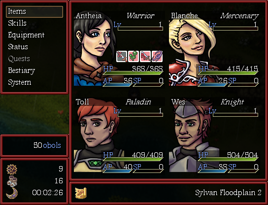
This is it showing the four main characters.
I've been learning Ruby for the last couple of months, and prior to that, I was ready to commission someone to make this for me, so I'm pretty stoked that I was able to do it myself. Any suggestions? -
A test video from my 'AI Behavior System for NPC'. In this video, I'm testing the thought-action system.
-
I think that it's a really cool idea, but eliminates the need for players to explore the game because everything's said for them.
-
@Harrumi I completely disagree. This idea can make towns and villages feel very alive with just menial dialog. It can also let the player know which NPCs have something interesting to say. It doesn't have to be the actual interaction dialog.
-
There are two sides to every story. lol if you can use it then that's awesome. Just from the video that's the feel I got.
-
@Harrumi | @KanaX : When I create the topic, I think that everyone will understand better. Yes, the 'thought' main ideia is to create a dynamic and lively place with interactive npcs. In this video don't show up, but the npcs can interact among theys. The main idea of 'thought behavior system' is the interact among npcs. Apart of this, this plugin has a 'dialog tree system', in which you can create dialogs with a special 'parser' markup language on external files.
-
@Kvothe If your main character is a psychic, it's a great idea.
If not, it feels very strange. Like you're a mind reader. -
As this beauty is 95% complete and will be ready to ship within the next couple of weeks, I feel that after 10 months of gruelling development I can finally share something from it.
Everything that you see here is custom, by the way -- that would explain why a game that is only three hours long took almost a year to create. -
The HD DLC was released but I forgot to share the video here. Time to rectify that!
-
@cabfe : in this case, you can set up if is visible or not. But the action will happens.
@NPX : WOW, this is very unique. What is about?
@Tuomo L : Sounds promissor. I never play a visual game before... then I don't have much to say
Second test: now everything at the basic, works. Bellow on spoiler, you can see how it is setup:
Setup of Peter
-
Not necessarily from the project I'm working on, but I felt like making a couple maps as a kind of tribute to the RM game that got me into game development in the first place. My maps were made entirely in GIMP, as most of the tiles I used weren't usable in the editor itself.
The Japanese version of the game was made from 2009-2010 in RM XP, the English version was made in 2012 in RM VX.
English and Japanese versions of the maps My versions of the maps

-
Well, this is actually the third map that I've been working on. After hearing some of the thoughts on empty spaces, I changed it before showing it.
Images belowTry One

Try Two

I feel like the outer sides need something. Not sure what. -
@NPX : WOW, this is very unique. What is about?
I'm playing it close to the chest, as I want it to be a surprise. But I assure you, in two weeks this game is gonna be blowing you away :D. -
@NPX Please do not spam this thread with posts unconnected with the purpose of this thread, which is to post game and map screenshots, not to just let people know that you are making a game.
@Ryisunique The second try is much better than the first. If I could make a few suggestions.
The proportions between the walls and roofs of your houses could be improved by having an additional row of roof tiles. Also, don't forget your chimneys, unless these houses have central heating.
That is a prodigious number of lamp posts - almost enough to light up a runway at an international airport. I'd reduce them somewhat.
The tile you have used for your pond is incorrect. The one you have used is just to indicate underwater ground/cliffs, and so should only be on upper edges. The rest should be from the ordinary water tile next to it on your tile sheet. Doing it that way will help give the impression of depth to the pond. If you want to have a shallow pond, then use only the ordinary water tile.
I think you could bring the houses even closer together. As you are not giving each house its own, individual garden, there's a lot of empty space still there. -
Here's a WIP of me just messing around.


