MV - Empty Tank: A near-future workplace roguelite [Demo playable in browser]

● ARCHIVED · READ-ONLY
Started by Alkaline 6 posts View original ↗

  1. 1729897121133.png

    SECTION A: SYNOPSIS
    Spoiler

    • Take the role of Zyx, a new hire at Paradise Inc. working for the Department of Defense. Everyday you must go through a gauntlet of battles against monsters that threaten the powers that be. While the company provides you with a mechanical arm to aid you in battle, the items you use to fight said battles are sold separately. Build your own arsenal to take on these monsters, but beware, you will fail your mission if you run out of items or if you fall in battle and have no money to pay for insurance. Best of luck rookie and welcome to Paradise Inc.!

    IMAGES/SCREENSHOTS
    Spoiler
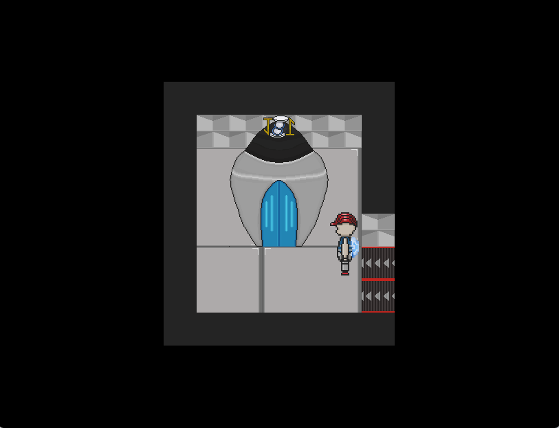
    Lobby
    1729898238981.png

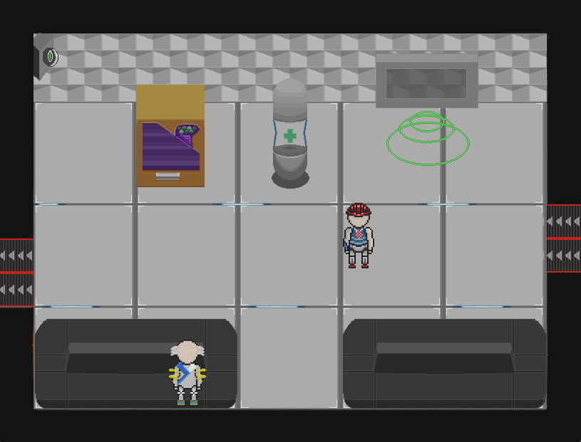
    Fight simulation room
    1729898310191.png

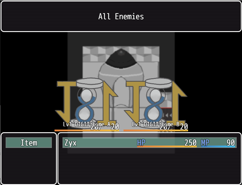
    Fighting DIGIT.time
    1729898359699.png


    SECTION B: CHARACTERS
    Spoiler

    • Zyx (that's you!)

      Won the lottery to be hired by Paradise Inc. after raising 500 Paradimes to pay for the application fee. Working day after day, Zyx has hopes to climb the corporate ladder and finally have a decent standard of living.
      (Honestly, there isn't much to be written about Zyx as it's supposed to be the player-insert character)

      Voxxy
      Your helpful H.R. manager that is responsible for hiring you and for giving your 1-minute orientation training so you can be up to speed in no time! Any questions? She won't answer, but she will chime in every now and then to make sure you're falling in line! Did I also mention that she only shows up as a voicebox?

      Qued
      In the beginning of Zyx's second day of work, Qued already started antagonizing the main character. Known for his insufferable love for the grind, he has no issues bragging about his work ethic. He believes he's doing better than you and will do everything in his power to make you believe it too. Fiending for that same promotion you're after, Qued will stop at nothing to leave others behind.

    SECTION C: STORYLINE/PLOT (WIP)
    Spoiler

    • You are hired for a 1-month contract, where for the first 15 days you will be analyzed and evaluated on your performance for a potential promotion or renewal. During the month, workers from other departments will randomly show up at the lobby to give you quests, however, they will only show for a certain period of time, if you don't find them after you finished your quest, you won't get the reward. You will also note the presence of a mysterious figure showing up draped in green with a big triangle in its core. A member of the revolutionary group called "The Blindspot" will request your aid in crumbling Paradise's empire. Will you aid them? Will you work for your promotion? Or will you simply try to get by?

    SECTION D: SETTING AND/OR WORLD DEVELOPMENT
    Spoiler

    • After the Great Financial War, the world as we known had completely changed.

      Paradise Inc. was not always like this. Before it became the sole conglomerate in the world, Paradise Inc. went by a different name and was the leading brand for all kinds of commerce. The company had grown to a point where its monopoly had completely cornered their market. Shareholders grew concerned and weary of the company’s future. With total control of every commercial affair throughout the world, there was nowhere else to go in that industry.

      The C-Suites started to investigate other markets to topple with the company and set their eyes on the coffee industry. From purchasing local coffee shops to offshore coffee farms, the company rapidly grew within the field and so did tensions between them and coffee giant JitterJolts. In a divide and conquer style, the company went as far as supporting and financing the unionizing of JitterJolts workers all over the world. The ones not interested in unionizing would be hired to work in the shops the company had already set up. The ones who remained at JitterJolts managed to create and spread the benefits throughout the entire coffee chain. With a drastic profit reduction, the coffee giants started closing shops and began collapsing under their own weight. The merge and acquisition were the coup-de-grace of JitterJolts which showed the other industries that the company was a force to be reckoned with, thus starting the Great Financial War. As for the workers, once JitterJolt was taken over, all their benefits and raises were revoked by the company.

    ITCH.IO LINK FOR DEMO [PLAYABLE IN BROWSER]
    Spoiler
    Empty Tank by Alkaline6022 For mobile users: https://alkaline6022.itch.io/empty-tank-mobile (also playable in browser)
  2. I played your game for the forum’s Web Feedback Festival. I recognize the effort it takes to get a game in a playable state and released for people to try, so if you don’t care to read constructive criticism, all of my thoughts are in spoilers. If you do read it, I hope some of it provides you useful thoughts when working on this or future projects.

    Spoiler
    The default title theme is…kind of a no-no at this point. Yes, it’s a part of the RTP so you’re perfectly entitled to use it. But so many people leave it in their low-effort projects that it just gives a bad first impression. Especially when it doesn’t seem to match the futuristic theme of your game.

    The first map is a bit visually offputting. The way all the tiles and the objects are all moving and pulsating is not pleasant to look at. I’ve seen worse, this didn’t make me sick to my stomach or anything, but it would some people.

    The name of the organization doesn’t make great grammatical sense - Defense and Destroy are two different types of word. It would be Defend and Destroy or Defense and Destruction.

    There are numerous places in the text windows where there are odd-looking double spaces between words.

    In the How to play on the Web site, why say to use arrow keys to move then Z to select? Enter is right next to the arrow keys.

    My first fight was two DIGIT.chains, and the battle screen doesn’t look great. The black and grey of the enemy sprites blended into the black and grey of the map which was the only battleback, so it was hard to tell what they look like.

    Additionally, the enemy sprites were so far down on the screen that the name and HP gauge displayed when selecting them overlapped into the sprites.

    Also, again, default battle music.

    You can go into the menu (or the Equips screen in the shop) and see that your character has a Sword, Shield, Hat, and Cloth - the default items for the default character in a new project. If you’re not going to be using attacks or skills or equipment, you could take a modicum of effort to remove that from the menu.

    The English is moderately poor. I see your profile says it’s your native language, but frankly I wouldn't have believed that from playing the game. There are errors in many of the dialogue windows and item descriptions, including the sort of incorrect phrasing that you wouldn’t expect from a native English speaker.

    I don't know if there's some reason you'd be trying to emulate the writing of a badly-translated app game, but I don't think it's a great design choice. The best I can say is that there are few blatant misspellings, so it is better than some of the other games I’m testing in that regard.

    Overall, I appreciate that you seem to have spent the most effort on making your own artwork, but everything else in the game seems very low effort. All the default music and sound, default equipment, not bothering to remove that equipment/menu item, not running the text through a grammar check or getting a proof reader.

    I think a lot of that could be solved with very little effort, significantly improving the game.
  3. Thank you for playing the game!

    Spoiler
    ATT_Turan said:
    The default title theme is…kind of a no-no at this point. Yes, it’s a part of the RTP so you’re perfectly entitled to use it. But so many people leave it in their low-effort projects that it just gives a bad first impression. Especially when it doesn’t seem to match the futuristic theme of your game.
    I haven't done anything for the music yet, it was just the default but I dont plan on using it. I'm hoping down the line to commission someone to do a few songs to compose the game's soundtrack.
    ATT_Turan said:
    The first map is a bit visually offputting. The way all the tiles and the objects are all moving and pulsating is not pleasant to look at. I’ve seen worse, this didn’t make me sick to my stomach or anything, but it would some people.
    Interesting! I was aiming for some more futuristic/sci-fi look where the lights move through the ground and theres lots of flashing lights and things levitating. Never crossed my mind that motion sickness would arise from it.
    ATT_Turan said:
    The name of the organization doesn’t make great grammatical sense - Defense and Destroy are two different types of word. It would be Defend and Destroy or Defense and Destruction.

    There are numerous places in the text windows where there are odd-looking double spaces between words.
    The text was mostly placeholder just to test the flow and pacing of the game with some basic information which I will go back and make its proper adjustments. Many of these things end up going unnoticed from just me playtesting the game over and over.
    ATT_Turan said:
    In the How to play on the Web site, why say to use arrow keys to move then Z to select? Enter is right next to the arrow keys.
    I feel like Z,X and arrow keys are a pretty traditional control scheme for web browser games instead of crumpling both hands near the enter and arrow keys...
    ATT_Turan said:
    My first fight was two DIGIT.chains, and the battle screen doesn’t look great. The black and grey of the enemy sprites blended into the black and grey of the map which was the only battleback, so it was hard to tell what they look like.

    Additionally, the enemy sprites were so far down on the screen that the name and HP gauge displayed when selecting them overlapped into the sprites.
    I'm working on a battleback for the fights so it's less jarring and easier to read, but I will correct the enemy positioning thanks for pointing that out.
    ATT_Turan said:
    Also, again, default battle music.

    You can go into the menu (or the Equips screen in the shop) and see that your character has a Sword, Shield, Hat, and Cloth - the default items for the default character in a new project. If you’re not going to be using attacks or skills or equipment, you could take a modicum of effort to remove that from the menu.
    This is something that stumped me a bit because I want to have them be able to equip one or two accessories at max but remove the weapon/armor equips altogether.
    ATT_Turan said:
    The English is moderately poor. I see your profile says it’s your native language, but frankly I wouldn't have believed that from playing the game. There are errors in many of the dialogue windows and item descriptions, including the sort of incorrect phrasing that you wouldn’t expect from a native English speaker.

    I don't know if there's some reason you'd be trying to emulate the writing of a badly-translated app game, but I don't think it's a great design choice. The best I can say is that there are few blatant misspellings, so it is better than some of the other games I’m testing in that regard.
    It's not by choice in anyway, the text again is mostly a placeholder just to give a basic overall idea of what's going on.
    ATT_Turan said:
    Overall, I appreciate that you seem to have spent the most effort on making your own artwork, but everything else in the game seems very low effort. All the default music and sound, default equipment, not bothering to remove that equipment/menu item, not running the text through a grammar check or getting a proof reader.

    I think a lot of that could be solved with very little effort, significantly improving the game.
    There's a lot to manage and go over in developing this game on my own, I can assure you that it's not a lack of effort. There are many things I'm learning on the go with little to no feedback to help me catch on things that my eyes have become accustomed to.

    The goal of this demo is to mainly understand how people feel about the game mechanics and its core loop which are the parts I've spent most time developing, along with the art. Would love to hear your thoughts on those bits too!


    Once again, thanks for playing and for the feedback
  4. Alkaline said:
    little to no feedback to help me catch on things that my eyes have become accustomed to.
    I absolutely understand that can be a thing, which is why I tried to choose games that had few or no replies for the feedback event. I figure that can help devs realize what things immediately stick out to to other people trying the game for the first time.

    I did give some comments on the art - I think overall your drawing of things is fine.

    I think the number of animated things on the main map is too much for my taste, and there are some design choices you could clean up in battle - even a black battleback would look better than the default blurred map, and the enemy sprites shouldn't be overlapping with their names and HP.

    I wasn't trying to be overly harsh with the "effort" comments, and I'm glad you didn't take it that way, but: for example, it takes one click in your System tab to disable the Equip menu command. And that's not even a default part of the Shop scene, so you had to have intentionally added a plugin that adds Equip to the shop.

    Then, similarly, it takes just a few clicks and a few seconds to choose a different title and battle music. That kind of stuff :smile: I'm not quite that strict, but there are reviewers hanging around here who will immediately quit the game if they hear the default theme music.

    Good luck with your project!
  5. New update is out! The game is shaping up to what I had initially envisioned so check it out!
    Code:
    Updates include:
    
    - With the use of MythAtelier's Card Game Combat plugin, Empty Tank now can look and play as it was originally conceived!
    
    - An introductory dialogue + fully functional (and optional) tutorial battle!
    
    - More enemies added!
    
    -Updated enemypedia!
    
    -Item fusions (can you find them all?)
    
    -Changes on the debuffs from not paying daily expenses
    
    ...and more!
    
    Manage your money, inventory and health, and make it through the first 3 days of working at Paradise Inc.!
    Battle Preview
    New battleback for better visualization
    New UI elements
    Screenshot 2025-02-03 193847.png

    Enemypedia
    Enemypedia now keeps track of the next enemies you'll face!
    Screenshot 2025-02-03 193950.png
  6. I gave your game a try to see if you were still using the SRD_HUDMaker plugin or not, and if you'd managed to get past some issues that I'd been having with browser console warning messages when trying to post it to play directly on itch.io. While it doesn't look like the SRD stuff is involved in yours, you've also got the thousands of warnings
    "The provided value 'undefined' is not a valid enum value of type CanvasTextAlign." from Bitmap.drawText @ rpg_core.js:1348
    that I've been getting on mine. So, it's not just me.

    I noticed that some of ATT_Turan's comments no longer apply because they've been addressed, yay!