Here's my very quick and sketchy take on the game
(link for info on why it's so short and all that jazz)
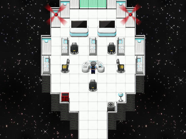
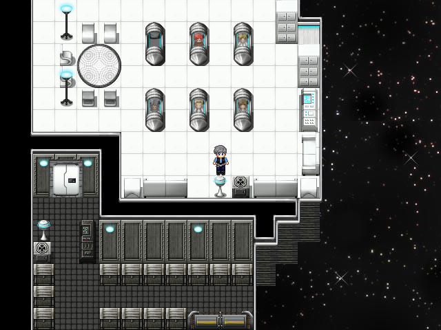
+Overall good mapping and presentation.
+The subdued tone is good as it leaves you intrigued rather than impatient.
+The amount of stuff you can investigate is nice.
+It’s not bogged down with initial long exposition.
-That said, the initial dialog goes for a SMIDGE too long. Just a bit. The two characters repeat the same general idea of “I have to fix it” for too long.
-The initial camera pan at the intro goes on for WAAAAYY too long. It totally saps any energy or ambience from the intro.
-The font is really not suited for the game, as it’s too hard to read and does not suit the futuristic tone. I’d recommend switching to a simpler font for readability.
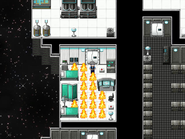
-There are TOO many things to manipulate and no distinction of what is important. Some signals such as shiny spots or floating arrows would help a LOT to guide the player to the main machines and boxes.
-Some of the manipulation of machinery is not visual at all (closing those vents does not change them at all graphically, which is a bit awkward).
-The machinery menus have a very confusing background that does not help with readability.
To the developer: I feel like this game would be very good if a couple things got fixed: the font, the menu background, and the interactivity cues. Those are what I feel keep this game from being very nice, since they turn an otherwise intriguing game into a sudden “everything can be touched and I have no idea of what I’m doing at all since everything looks the same as before”. With some edits here and there (visual cues mostly) I think It’d be pretty nice. I may give this a twirl calmly and to full once the game list is over.